how do you want the buttons to highlight?will the text be within the highlighted rectangle, or will it be outside, as it currently is?On Sat, Nov 12, 2011 at 02:43, Evan Lin <hairymonkey.evan@xxxxxxxxx> wrote:
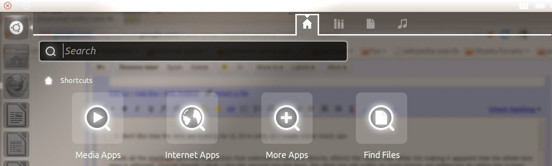
_______________________________________________Here is my mock up of what I think home dash should look like.
--
Evan Lin
Mailing list: https://launchpad.net/~ayatana
Post to : ayatana@xxxxxxxxxxxxxxxxxxx
Unsubscribe : https://launchpad.net/~ayatana
More help : https://help.launchpad.net/ListHelp
_______________________________________________
Mailing list: https://launchpad.net/~ayatana
Post to : ayatana@xxxxxxxxxxxxxxxxxxx
Unsubscribe : https://launchpad.net/~ayatana
More help : https://help.launchpad.net/ListHelp
Attachment:
LensBarToTopModified.jpg
Description: JPEG image