dhis2-users team mailing list archive
-
 dhis2-users team
-
Mailing list archive
-
Message #12054
Re: Tutorial: Create a scorecard in the Pivot Table app
Dear Rachael,
Thanks for sharing this.
However, from our experience in Uganda, there are scenarios where indicator
max and min values are reversed e.g maternal deaths (Low values =red and
HIGH values = Green) and in some cases like C-Section indicator ( 0-5 & >15
represents Red and 5-15 = green), do you know how this can be included in
the scorecard using legends and pivot tables?
Thanks.
Alex
On Tuesday, December 20, 2016, Rachael Brooke <rachael@xxxxxxxxx> wrote:
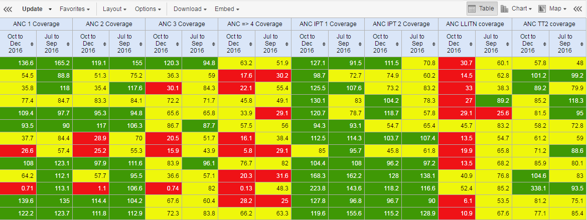
> Hi,
>
> In just a few steps, learn how to create a scorecard in the Pivot Table
> app. This is handy as it means you can share a scorecard on your
> DHIS2 dashboard and use it offline. It's straightforward to do!
>
> Read the tutorial here: https://ci.dhis2.org/…/ma…/en/user/html/dhis2_
> tutorials.html
> <https://ci.dhis2.org/docs/master/en/user/html/dhis2_tutorials.html>
>
> [image: Inline image 1]
>
>
> *Feedback welcome :-)*
>
> *DHIS2 Content Team*
> rachael@xxxxxxxxx <javascript:_e(%7B%7D,'cvml','rachael@xxxxxxxxx');>
> cecilia@xxxxxxxxx <javascript:_e(%7B%7D,'cvml','cecilia@xxxxxxxxx');>
>
--
Alex Tumwesigye
Technical Advisor - DHIS2 (Consultant),
Ministry of Health/AFENET | HISP Uganda
Kampala
Uganda
+256 774149 775, + 256 759 800161
Skype ID: talexie
IT Consultant (Servers, Networks and Security, Health Information Systems -
DHIS2, Disease Outbreak & Surveillance Systems) & Solar Consultant
"I don't want to be anything other than what I have been - one tree hill "
Follow ups
References