Those are nifty. Other variations:
- small progress bars overlayed on the icons (say, b&w only)
- desaturate the icon and have the saturation return from left to
right, or with the clock-arm sweep, instead of using a colour
Mark
I've just realized I've been replying to people individually instead of to the list! (*slaps forehead*)
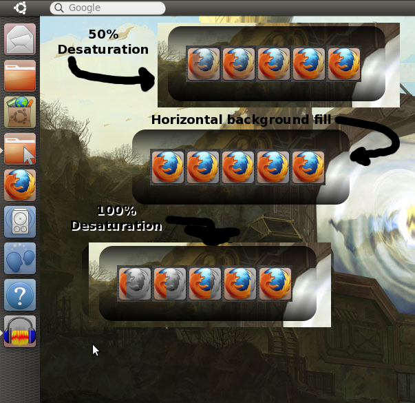
I think the suggestions / mockups were all very cool. I've attached a few with the Firefox icon but
they don't seem to be emphatic
enough - besides the greyscale one
which as you pointed out Mark, does look a little like there's a problem
with the application until the first bit of color is introduced. We could start with a 10% fill always to indicate this maybe?
I included the original idea, for comparison, one
with 50% desaturation, and one
with background bar, keeping the
icon in full saturation. It's barely noticeable the way I have it at the moment though.
The radial idea is cool, it's like the minute hand of a clock. But personally I would base on an existing progress metaphor rather than adding a new one.
The fuse is really nice. I think it could be bigger .. and then I think, no, it's great as it is. It doesn't get in the way and it seems clear on my display.
So, the only one we haven't seen yet is the overlaid bar idea. I might give that a bash tomorrow if no-one has beaten me to it :)