On Wed, 2011-04-20 at 11:50 -0500, S. Christian Collins wrote:
Hi folks,
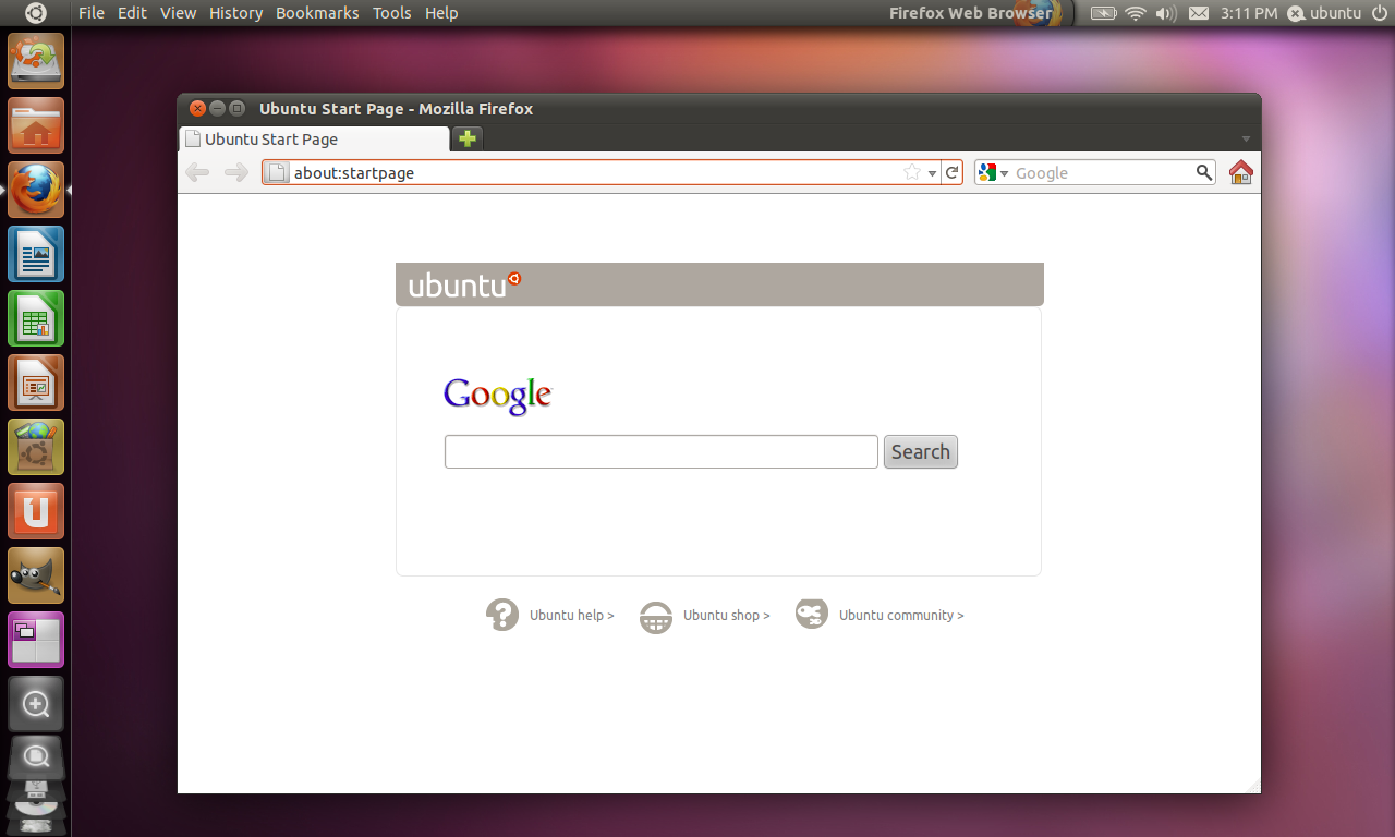
Many people have mentioned the problems with the inconsistency of the new panel (menu only visible on hover, etc.). Here is my proposed solution to this problem:Have a look at my mockup and decide for yourself:
- The menu of the active window is always displayed in the panel.
- The title of the active application is displayed on the right side of the panel, just to the left of the system tray.
- There is a clear division in the panel between the application title and the system tray to visually link the window's title with its menu.
- The application's icon is displayed transparently beneath the window title for at-a-glance identification of the active window. This would make it easier to tell which window is currently active.
- If the active window's menu is long enough to drift into the application title, the title would simply fade out at its leftmost edge (similar to its current behavior whereby the title fades at the rightmost edge when the menu appears).
-~Chris_______________________________________________ Mailing list: https://launchpad.net/~ayatana Post to : ayatana@xxxxxxxxxxxxxxxxxxx Unsubscribe : https://launchpad.net/~ayatana More help : https://help.launchpad.net/ListHelp
