However, this requires developers to rewrite their programs with touch friendly interfaces and does not, in the intervening time, offer a solution.
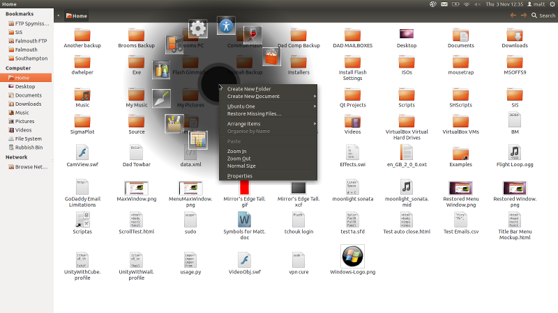
As an all round solution I suggest replacing the context menu with a gnome pie menu which would contain the context menu items in the right half, and the top menus as items in the left half.
For example:
Right clicking a blank space in Nautilus would bring up a pie in which 'Create New Folder', 'Create New Document' etc through to 'Properties', would make up the right half of the pie and 'File', 'Edit', 'View' etc through to 'Help' would make up the left half of the pie.
In my opinion this would provide an easy way to access menus and would solve three problems with the current implementation:
1) The large amount of mouse travel required to hit the top menu for people with large screens
2) The requirement for an application to have focus before it's menu can be accessed
3) Menus as they stand are not touch friendly and creating a touch friendly interface requires work by the software developers
However, I understand that to retrieve the context menu options may require the program developers to explicitly make them available to Unity (something which again requires developers time and thus breaks the idea of saving them time creating new interfaces). As a compromise option therefore, we could use the default context menu, with the pie showing the top menu options in the remaining three quarters:

Any thoughts?
Matt