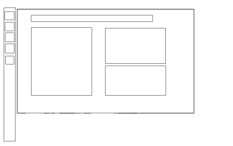
The Dash BoardThe Home LensThe home lens on the dash board is almost useless, there is no practical usability in the eight large buttons due to FireFox, ThunderBird and Banshee already present in the launcher. My recommendation for an improved Unity design is for the home lens to be made for modular panels that adds much more meaning and a modern look to the home screen. These modular panels are like graphical widgets for example:
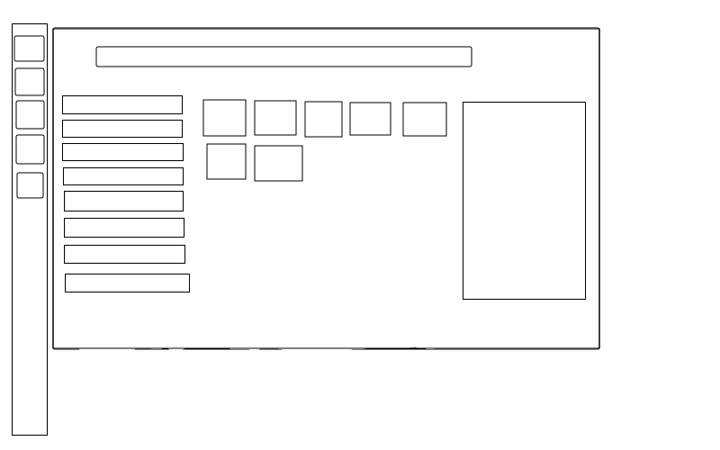
People with programing knowledge should be able to create custom panels and share them with everyone via the Ubuntu Software Centre which will also help get the community involved. The Application Lens Lets start by having a look at the current application screen, the screen is split up into the sections that are:
Each of these section to me are near useless due :
Apart from Banshee these are possibly the worst applications to show because they are barley ever used. But even if you did show very commonly used applications then you have the same problem as the most frequently used section.
To find an application that is not on my launcher (which also means not in the frequently used section) i must perform the following steps:
This takes a total of 6 steps compared to GNOME 2 that does this task in the 3 steps. Creating a new user interface should not re-invent the wheel, instead a new user interface should learn from its predecessor and improve aspects where appropriate. Unity should be an improved version of GNOME 2 not an entire new user interface that will takes years to produce a solid product. Personally this application screen is a complete disaster and is something I would not expect Ubuntu to produce. (adopt KISS - Keep It Simple & Stupid) The best feature of GNOME 2 that I liked was how it categorized applications (Office, Multimedia and Development for example). A simple list of the categories on the left with relating programs in the centre is simpler, more effective and quicker then the current setup. To open the application a user double clicks the icon and it opens, if the user clicks on it once then a side panel on the right appears that contain the following:
From this new layout design the steps to open an application are:
Four steps is an improvement on the current Unity’s six steps, although if the users sets the default lens to application there is only three steps equalling GNOME 2. When the user has yet too select the category the most frequently used programs can be shown in the centre by default. The File LensThe files screen should just be a light weight file browser including the following functionality:
Another LensThe dash board provides a quick and convenient method for accessing and viewing program and files. Although as modern systems evolve average users are required to alter the settings of their computer more than ever. This why there should be a lens for basic computer settings for the user to conveniently edit via the dash board. Such settings could be:
The design layout should closely follow the applications lens because consistency is always good. On the left has a list of the grouped settings as listed above with the centre section containing all the settings a user may edit. Other NotesOther ideas that can enhance the dash board could be:
The LauncherThe launcher is in a similar situation with the dash board, good idea but has a couple of design flaws. However the launcher isn't as bad as the dash board, to be precise there are only two aspects of the launcher that really need an improvement in my opinion. The first one is when the user hovers the mouse over the icon a menu should appear to the side with the following items (just like when you right click on the icon):
The purpose behind this was that I first found it hard to open multiple instances of an application. As you know once an application is open clicking the icon again will only focus back on to that application. To open a new one I had to do so via the dash board but the point of the launcher is to quickly open applications. Personally i found this rather annoying and asking my self what is the point of the launcher if it cant do its job completely. This improvement will help eliminate any confusion that users may experience while using Unity to manage their open programs. The second one is that the launcher is not workspace specific as of Ubuntu 11.10, for example
This is almost defeating the propose of having multiple workspaces and or making it harder to manage their application across multiple workspaces. The Ubuntu community have long loved the feature of multiple workspaces so the last thing you wont to do is take it away from them. Other NotesOther ideas that can enhance the launcher could be:
|
Attachment:
app-lens.png
Description: PNG image
Attachment:
home-lens.png
Description: PNG image