unity-design team mailing list archive
-
 unity-design team
-
Mailing list archive
-
Message #03274
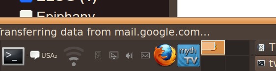
Undersized indicator icons
Indicator icons are much smaller than their containing panel would currently
allow.

I've got a high-resolution screen, that's viewed at a considerable distance,
so everything needs to be quite large (in terms of pixels) to be usable. A
similar argument probably applies to visually impaired users.

See the attached image. The indicator icons are all tiny. Launchers, and
even some notification icons (like nm-applet's) scale up *beautifully* to
take all the space they're offered. The notification area's pretty
inconsistent about this, but you get the idea.

Should the indicator icons be sized according to the panel they're on? If
they're really going to be much smaller, should they support multiple rows,
so they don't waste so much space?

Thoughts?

--
Jeremy Nickurak -= Email/XMPP: jeremy@xxxxxxxxxxx =-
Attachment:
tiny-indicator-icons.jpg
Description: JPEG image
Follow ups