unity-design team mailing list archive
-
 unity-design team
-
Mailing list archive
-
Message #04048
Unity Sidebar Background
Hi.

I think that the current idea of having the sidebar have a solid background
is a bad idea.

Whenever the dash is activated or a place is opened, the top bar turns
transparent. However, when the top bar is solid, it seems that the sidebar
is underneath it. When the top bar suddenly disappears, then, it seems very
odd that the sidebar is going underneath a transparent surface, but yet
doesn't show through. This is very disconcerting.

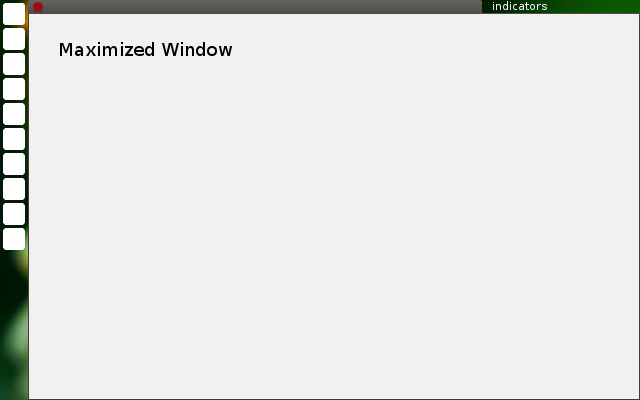
An alternative to this is to have the sidebar have a transparent background,
showing the desktop underneath. This would cause separation from the top
panel. Instead I propose this:


   - All panels are transparent
   - The Ubuntu Button is a rounded square, like other icons, but doesn't
   fold.
   - The space between the indicators is filled with the window title, like
   a tab.

Here is a mockup:
[image: mockup.png]

This would make the transition to the unity dash and places much smoother,
since it would only look like the windows are fading out, unlike the current
random transitions.

What do you think?

Follow ups