unity-design team mailing list archive
-
 unity-design team
-
Mailing list archive
-
Message #04411
Re: Messaging Menu and the MeMenu
> > Right now, the Messaging Menu and MeMenu are kind of connected, in that
> > the functionality of the MeMenu changes by clicks in the Messaging Menu.
> > For example, to get a text box for a broadcast account in the MeMenu,
> > the user has to go to the Messaging Menu to start Gwibber. Furthermore,
> > to actually use the inactive status buttons in the MeMenu, the user has
> > to start chat from the messaging menu,
>
> As Conscious user said, the IM status problem has always been a bug. The
> Gwibber problem, on the other hand, is a design flaw.
>
> > One solution could be merging the two menus, but that could create too
> > large a menu. A better solution could be to have the textbox and
> > buttons appear when the user sets up the two accounts for the first
> > time, and to keep them active.
>
> I think both of those would make a lot of sense. Perhaps someone could
> sketch what a combined menu might look like?
>
> > I would like to know what the rationale for the current functionality
> > is.
>
> There is none.
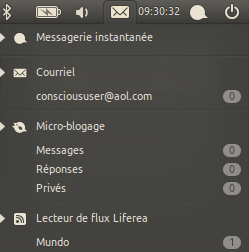
I'm resurrecting this thread now that I'm finally regularly on Maverick.
The more I use the Message Menu, the more I get convinced that it
shouldn't have more functionality than it does now. In fact, I got
fed up of the "Contacts" and "Compose" in the Evolution entry and
removed them, making the menu purely an inbox (see attachment)
I think the Messaging Menu *should* be purely an inbox, because one
of the most common complaints against the notifications redesign
is how reacting to IM/mail notifications is now less efficient
(opening an menu and looking for an entry instead of simply clicking
on the tray icon). I personally think that the difference is
negligible, but *only* if the menu is not too cluttered.
I don't think the current separation between the Message and Me menus
is necessarily a bad thing. I believe it only needs some refinement,
both in design and implementation, to show that the idea of thinking
functionality-wise (inbox vs. outbox) instead of application-wise
(empathy, evolution, etc.) is not absurd as it seems at a first glance.
Some things that get in the way of this objective now:
- Shortcuts for configuring im/microblog accounts in the Me Menu.
This overlaps with the messaging menu directly and keeping those
entries there does not make sense once the accounts are configured...
the Messaging Menu does it more correctly, showing them only if
no accounts are configured
- Ubuntu One in the Me Menu... I don't think it really fits.
- "Contacts" and "Compose" in the Messaging Menu... having two
"outbox" entries lost in the middle looks and feels wrong...
and adds clutter
Attachment:
menu.png
Description: PNG image
Follow ups
References