unity-design team mailing list archive
-
 unity-design team
-
Mailing list archive
-
Message #05568
Re: Persistent menu mockup
I like that idea.

On Wed, 2011-04-20 at 11:50 -0500, S. Christian Collins wrote:

> Hi folks,
>
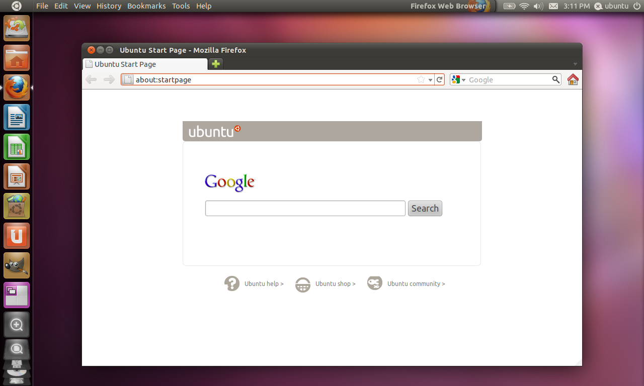
> Many people have mentioned the problems with the inconsistency of the
> new panel (menu only visible on hover, etc.).  Here is my proposed
> solution to this problem:
>       * The menu of the active window is always displayed in the
>         panel.
>       * The title of the active application is displayed on the right
>         side of the panel, just to the left of the system tray.
>       * There is a clear division in the panel between the application
>         title and the system tray to visually link the window's title
>         with its menu.
>       * The application's icon is displayed transparently beneath the
>         window title for at-a-glance identification of the active
>         window.  This would make it easier to tell which window is
>         currently active.
>       * If the active window's menu is long enough to drift into the
>         application title, the title would simply fade out at its
>         leftmost edge (similar to its current behavior whereby the
>         title fades at the rightmost edge when the menu appears).
> Have a look at my mockup and decide for yourself:
>
>
>
> -~Chris
>
> _______________________________________________
> Mailing list: https://launchpad.net/~ayatana
> Post to     : ayatana@xxxxxxxxxxxxxxxxxxx
> Unsubscribe : https://launchpad.net/~ayatana
> More help   : https://help.launchpad.net/ListHelp

References