unity-design team mailing list archive
-
 unity-design team
-
Mailing list archive
-
Message #05619
Ideas for Unity Design Tweaks
Hello,
I've been using Unity for about a week now -- which makes me perfectly
qualified to critique every nuance of it! ;-)
But seriously, overall, I like it. Maximizing a window has beautiful
results, and I really enjoy the use of Meta+# to switch quickly to
other applications (when I remember to do it). I spend a lot of time,
however, working with multiple windows in a sort of jumbled mess. But
there's a method to my madness. And I'm not the only one with
long-standing personal desktop usage traditions, as I'm sure you're
all aware.
Anyway, the global menu bar is not compatible with the way I work,
especially since I don't know if a window has a menu until I hover my
mouse over the top bar. Also, I've long been of the habit of putting
certain windows (*cough* IM windows) all the way toward the bottom
right of the screen, which makes that window's menu appearing in the
upper left all the more annoying.
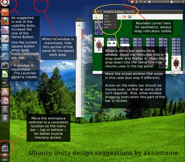
My mockup applies nearly exclusively to scenarios where there isn't a
maximized window. There are four main changes, as follows:
1. At some point recently, I read a Unity usability study which
indicated that the Home Button is not conspicuous enough to new users.
My solution to this is to make it as large as the other buttons on
the Launcher panel, but do not depart from the top panel. The idea I
have is that, by default, it will be a big, round button, as shown in
the mockup. But if both
- a window is maximized, and
- the Launcher panel is hidden (options allow the Launcher panel
to never hide),
it will shrink to fit the top panel as it currently does. I imagine a
transitional animation of the logo growing / shrinking as the mouse
cursor is moved into the upper left corner -- the same action which
most quickly invokes the launcher panel when it is hidden.
2. The menu bar should, in some way, still be built into its window.
The way I propose is to have a button appear on the title bar, a-la
Firefox 4. Hovering the mouse over this button will reveal the menu.
Mouse actions on the "button" should be the same as any other part of
the title bar, just that the mouse-over event will reveal the
drop-down menus stacked vertically. The label on the button should be
the same as currently appears in the global menu bar, i.e. "Firefox
Web Browser". Then next to that, if the text is any different, the
regular window title will appear.
Hitting Alt should drop down this menu, as well.
3. With #2 done, the section of the top panel containing the global
menu can be removed entirely, leaving only the Indicators and Home
Button. This would increase workspace, particularly on high
resolution wide screens. The indicators will always be visible, and
there should probably be some rounded edge cut-off where the
indicators end.
4. Not entirely related, but the Workspace Switcher should not be in
the middle of the Launcher panel by default. It should be positioned
statically, either just below the Home Button or just above the Trash
(I understand Mark insists that the Trash be at the bottom, no matter
what). This will make it slightly more accessible via mouse, as its
position can be memorized, regardless of how many applications are
open.
Thank you for reading, and I hope something constructive can come of
this mockup. :)
-Anthony
Attachment:
Unity Mockup 2.jpg
Description: JPEG image
Follow ups