1)The latest dash (with 11.10) has a list of lenses at the bottom-
center.
The icons for each lens(home, apps, files, music)are kinda small and non
obvious as to their purpose.
IMHO, both novices and experienced users will find it more useful if the
lens buttons were accompanied by a name and were above the search bar
(minimum mouse movement from clicking the dash button, visually
obvious).
| [icon]Home | [icon]Apps |
[icon] FIles&Folders | [Icon] Music|
|Search bar|
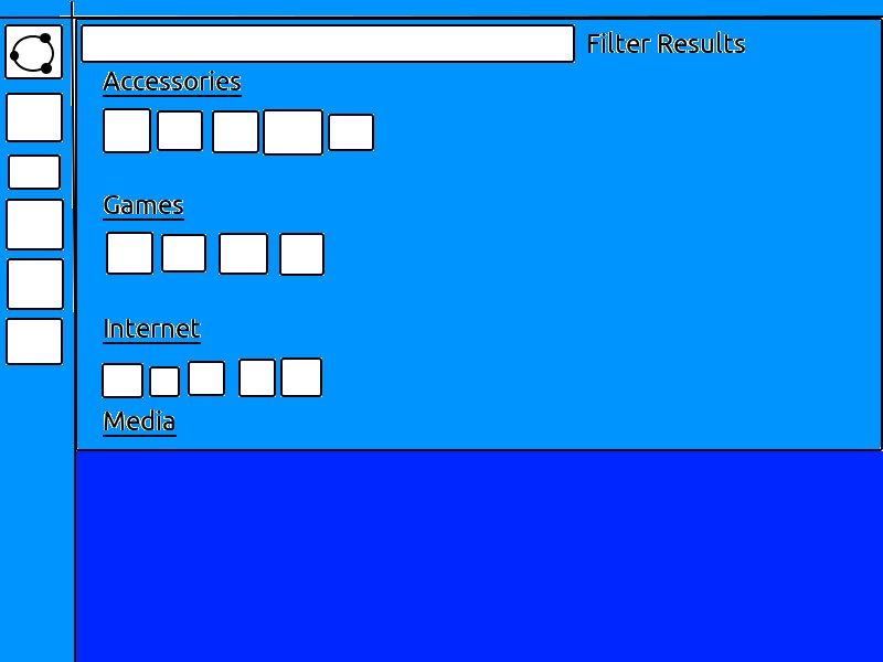
2)New users tend to browse for installed apps.
It might be useful if the filter results list is expanded by default
. presents a familiar/ simple method to browse.