unity-design team mailing list archive
-
 unity-design team
-
Mailing list archive
-
Message #06922
Pane handles should be made more visible
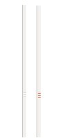
The pane handles, used to decide the size of the left/right or
upper/lower part of a pane, are very difficult to see. This has been
bothering me for quite some time. I think maybe the dots on the handles
should use the same colors as the scrollbars. I provide an example. As
you can see, it's not a radical change, but it does make the handles
easier to see.
Jo-Erlend Schinstad
Attachment:
pane-handle-proposal.jpg
Description: JPEG image
Follow ups