| Thread Previous • Date Previous • Date Next • Thread Next |
   The Dash Board

------------------------------------------------------------------------


         The Home Lens

------------------------------------------------------------------------
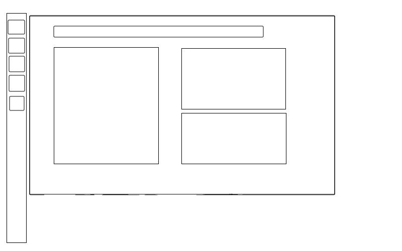
The home lens on the dash board is almost useless, there is no practical
usability in the eight large buttons due to FireFox, ThunderBird and
Banshee already present in the launcher. My recommendation for an
improved Unity design is for the home lens to be made for modular panels
that adds much more meaning and a modern look to the home screen. These
modular panels are like graphical widgets for example:
     o FaceBook\Twitter
     o Open applications and tabs in FireFox or Chrome
     o Time\Calendar
     o Weather
     o CPU Monitor
     o Network Monitor
     o Memory Monitor
     o Slide-show
     o RSS reader
     o Computer Information
     o System Messages (Updates, Missing Drivers etc)
     o Stocks
     o Notes
People with programing knowledge should be able to create custom panels
and share them with everyone via the Ubuntu Software Centre which will
also help get the community involved.
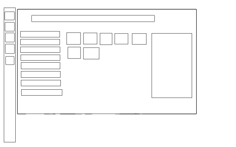
The Application Lens
------------------------------------------------------------------------
Lets start by having a look at the current application screen, the screen is split up into the sections that are:
 * Frequently used
 * Installed
 * Apps to download


Each of these section to me are near useless due :

 * I don't know about you but the programs in my frequently used
   sections are already on the launcher. Every time i go to the
   application lens is to open an application that I infrequently use
   which funny enough are never in the frequently used section.
 * The installed section shows the following items on my machine:
     o Installed Drivers
     o Some card game
     o Appearance
     o Archive Manager
     o Backup
     o Banshee
Apart from Banshee these are possibly the worst applications to show
because they are barley ever used. But even if you did show very
commonly used applications then you have the same problem as the most
frequently used section.
 * The download sections show nothing useful to download, people either
   know which programs they want to install or people including me
   don't even know what this applications are even designed for that
   have been suggested.
To find an application that is not on my launcher (which also means not in the frequently used section) i must perform the following steps:
 * Open the dash board
 * Click the applications lens
 * Click the filter results button
 * Click the category of the application  (because scrolling through
   110 applications is not fun)
 * Click the button to expand he installed section (in my experience
   over half the time i need to expand)
 * Open the application
This takes a total of 6 steps compared to GNOME 2 that does this task in the 3 steps. Creating a new user interface should not re-invent the wheel, instead a new user interface should learn from its predecessor and improve aspects where appropriate. Unity should be an improved version of GNOME 2 not an entire new user interface that will takes years to produce a solid product. Personally this application screen is a complete disaster and is something I would not expect Ubuntu to produce. (adopt KISS - Keep It Simple & Stupid)
The best feature of GNOME 2 that I liked was how it categorized applications (Office, Multimedia and Development for example). A simple list of the categories on the left with relating programs in the centre is simpler, more effective and quicker then the current setup. To open the application a user double clicks the icon and it opens, if the user clicks on it once then a side panel on the right appears that contain the following:
 * A description about the program
 * A preview picture of of the program
 * A button to open the program
 * A button to un-install the program
 * A button to link the program in the launcher
 * A button to change the category of the program
 * A button to update the program if can
 * A button to change the icon


From this new layout design the steps to open an application are:

 * Open the launcher
 * Click the applications screen
 * Click  the category
 * Select the program
Four steps is an improvement on the current Unity's six steps, although if the users sets the default lens to application there is only three steps equalling GNOME 2. When the user has yet too select the category the most frequently used programs can be shown in the centre by default.
         The File Lens

------------------------------------------------------------------------
The files screen should just be a light weight file browser including
the following functionality:
 * Browse through folders
 * Create and delete files and folders
 * Copy, cut and paste folders and files
 * Rename files and folders
 * Open files
 * Search for files and folders
 * Contain a side panel for quickly viewing images and pdf's


         Another Lens

------------------------------------------------------------------------
The dash board provides a quick and convenient method for accessing and
viewing program and files. Although as modern systems evolve average
users are required to alter the settings of their computer more than
ever. This why there should be a lens for basic computer settings for
the user to conveniently edit via the dash board. Such settings could be:
 * Wireless & Networks
 * Sound
 * Display & Appearance
 * Date & Time
 * Keyboard
 * Language
 * Printers
 * User Account
 * Battery
The design layout should closely follow the applications lens because consistency is always good. On the left has a list of the grouped settings as listed above with the centre section containing all the settings a user may edit.
         Other Notes

------------------------------------------------------------------------

Other ideas that can enhance the dash board could be:

 * Search more places such as
     o The Internet (Wikipedia for example)
     o Improved Ubuntu Software Centre searches
     o Cloud services such as (Ubuntu One, Google Docs, Dropbox for
       example)
     o Mail from ThunderBird
     o Bookmarks from FireFox and Chrome
     o Notes from TomBoy (or another note taking program)
     o Friends from social networking sites
 * The launcher opens in the same state as it was closed
 * The user can select which screen shows when the launcher opens


   The Launcher

------------------------------------------------------------------------
The launcher is in a similar situation with the dash board, good idea
but has a couple of design flaws. However the launcher isn't as bad as
the dash board, to be precise there are only two aspects of the launcher
that really need an improvement in my opinion. The first one is when the
user hovers the mouse over the icon a menu should appear to the side
with the following items (just like when you right click on the icon):
 * Open new instance of the program
 * View all instances
 * Close all instances
 * Remove from the launcher
 * Change icon
The purpose behind this was that I first found it hard to open multiple instances of an application. As you know once an application is open clicking the icon again will only focus back on to that application. To open a new one I had to do so via the dash board but the point of the launcher is to quickly open applications. Personally i found this rather annoying and asking my self what is the point of the launcher if it cant do its job completely. This improvement will help eliminate any confusion that users may experience while using Unity to manage their open programs.
The second one is that the launcher is not workspace specific as of Ubuntu 11.10, for example
 * I have no programs open at all and then I open FireFox on workspace 1
 * I then switch to workspace 2 and click the FireFox icon in the launcher
 * What I am expecting is another FireFox window in workspace 2 to open
   because workspace 1 should not affect workspace 2. This is the
   fundamental purpose of workspaces, that one can have many desktops
   running without them conflicting with each other, however when i
   click the icon on the launcher I am taking back to workspace 1.
This is almost defeating the propose of having multiple workspaces and or making it harder to manage their application across multiple workspaces. The Ubuntu community have long loved the feature of multiple workspaces so the last thing you wont to do is take it away from them.
         Other Notes

------------------------------------------------------------------------

Other ideas that can enhance the launcher could be:

 * Choosing where the launcher is positioned on the screen
 * Rather than having little arrows indicating how many instances are
   open display a number in a little box in the corner
 * Have the option of dragging some icons onto the desktop instead of
   keeping them on the launcher
 * Dragging icons up and down the launcher to rearrange the order of
   appearance
 * Shortcut to files, folders and web-pages etc
 * Folders that when clicked show another group of icons
 * Have an icon to show the desktop
Attachment:
app-lens.png
Description: PNG image
Attachment:
home-lens.png
Description: PNG image
| Thread Previous • Date Previous • Date Next • Thread Next |