unity-design team mailing list archive
-
 unity-design team
-
Mailing list archive
-
Message #08607
Re: More visible already started/active application in Launcher (for TV/tablets/phones)
Number five is the one I like best, and looks like the idea i had of golden
icons...idea number four il nice too. blurred icons could give problems to
people with bad sight maybe? desaturated ones are good for zombies :D...

2012/3/5 Matt Richardson <m.richardson.1990@xxxxxxxxxxxxx>

>  I use backlight toggles and I just tried opening multiple applications
> such that they collapsed. I don't see the problem you're talking about,
> perhaps you could elaborate?
> Personally I think that backlight toggles by default would really help new
> users to define which apps are open.
>
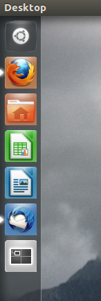
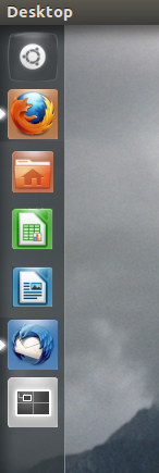
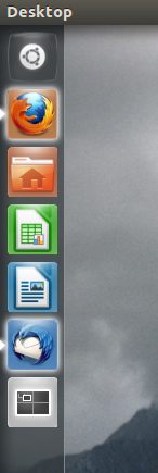
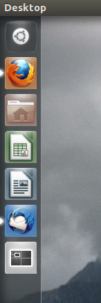
> Four other potential solutions (screenshots below):
>  - Desaturate the non-runnning apps, but not completely.
>  - Blur non-running apps slightly
>  - Shrink non-running apps
>  - Add a shine to running apps
>
> Matt
>
> Current:                 Desaturate:            Blur:
>    Shrunk:                 Glow:
> [image: Current] [image: Incomplete Desaturation] [image: Blur] [image:
> Shrunk] [image: Glow]
>
>
> On 04/03/12 22:50, Hans Heintze wrote:
>
> On 03/04/2012 04:14 PM, Bartosz wrote:
>
> Hi.
> I think the current indication of started and active application should be
> improved.
> The small arrows on the left/right side is not good visible (especially on
> tablet/phone sceen)
>
>  What is your proposal of improve visibility of the already started
> appplication?
>
>  And how we could improve currently active application?
>
>  I have already filled the bug for that issue:
> https://bugs.launchpad.net/ayatana-design/+bug/917951
>
>  Best Regards
> Bartosz
>
>
>  Agreed. There is a problem with enabling backlight toggle by default
> however, it makes it difficult to distinguish between collapsed tiles. tile
> theming needs to be reconsidered by design and likely redone all together
> for many reasons, including the following:
> -poor distinguishably for colourblind people
> -backlight in it's present form can obstruct application outline
> -tile theming does not correctly match the light source/dispersion of
> radiance theme
>
>
>
>
>
>
> --
> Mailing list: https://launchpad.net/~unity-design
> Post to     : unity-design@xxxxxxxxxxxxxxxxxxx
> Unsubscribe : https://launchpad.net/~unity-design
> More help   : https://help.launchpad.net/ListHelp
>
>


References