On 4 November 2010 04:59, Alex Launi
<alex.launi@xxxxxxxxxxxxx> wrote:
On Wed, 2010-11-03 at 10:15 +0000, Matthew Paul Thomas wrote:
-----BEGIN PGP SIGNED MESSAGE-----
Hash: SHA1

cmaglothin wrote on 20/10/10 04:43:
>
> Why not try this:
>
> 1. Instead of having the obscure "copy track data" feature, why not
> simplify the buttons in indicator-sound to something
> like http://imgur.com/ueC7X.jpg

Because that's a visual scope error: clicking a button would change
things both above it (track data) *and* to the left of it (album art).
I'm not sure I agree with this reasoning. The buttons there are clearly nestled into the warm embrace of the album art and the track metadata. If the controls were not clearly associated with both then this could be a reasonable argument, but the three are all very tightly coupled visually.
What about changing the function of the metadata item? As has been mentioned, copying track data to the clipboard is not particularly useful (to me, admittedly). When clicking it and not seeing anything happen I assumed it was a selectable no-op, until I read otherwise on this list.
Matthew, I think "selecting an informational item should display more detail about that information" is an excellent pattern. You should get it formalised :)
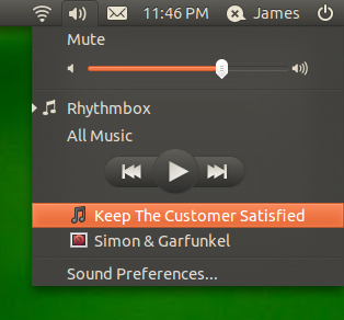
I was thinking if the metadata were split up its pieces could better represent themselves. I attached an image of what I mean.
"All Music" is the current playlist. I'm not sure whether that should open the playlist or be a submenu to playlist controls (maybe a limited selection of songs in the playlist, or shuffle/repeat controls). Because the rhythmbox/music library item could open to the current playlist, I lean towards wanting to make the playlist item a submenu. I might even have it say "Playing from All Music." Though I find submenus annoying when the menu is too close to the right edge of the screen :/
Player controls come next (though I'd rearrange them, but at this stage that's just preference :) followed by the playing track item, and then the track's artist.
The track item would focus the music library as specifically as possible on the track (eg Banshee's Now Playing view or similar). Likewise, the artist item would focus on the artist (eg an auto-playlist/filter, or a search). The missing icon should represent a playlist (it's a playlist for the artist) and the icon for the track should represent a music file, or at least be distinct from the music library icon.
Finally, I also attached a fairly average mock up of how i'd have the player controls
So that's my little spiel. I'd like to know if any of this is interesting to others? Ie worth me hacking it together. Or pros and cons etc?
James