| Thread Previous • Date Previous • Date Next • Thread Next |
Hi Alex and other GTG contributors,sorry for the late answer, many things are going on and I am piled in my e-mail. I love your mockups and I find it awesome. In this e-mail I would to raise some details which weren't discussed so far. Please, don't take it as nitpicking :-)
*General Layout:*
The Layout contains the Primary Toolbar (1), which holds the 'new task'
button and a View Switcher. I dont know if the Checkmark Selector (on
the right side) is really necessary, the space could also be used for
buttons which allow to toggle between different views. On the left you
can see the Tag-Sidebar (2) and on the bottom you can find the plugin
toolbar (3), which holds all additional elements required by plugins.
The plugin toolbar is only visible, if there are any plugins enabled.
I think view switcher should have these options:
 * active tasks - tasks that are shown in the current GTG window
 * next action / Work View - tasks that:
    * don't have any active subtasks
    * don't have start date or have start date in past
    * are not marked to be due Someday
    * don't have assigned any tag which is hidden in workview

    * in other words, tasks that I can work on at the moment
 * Tasks without tags -> something like Inbox
 * closed tasks - done + dismissed tasks
 * all tasks -- all tasks that are stored in GTG
Those modes would satisfy the needs of this bug
https://bugs.launchpad.net/gtg/+bug/630477 - make user aware about
"special modes"
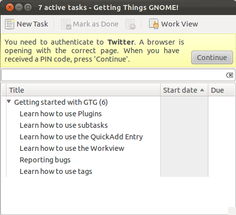
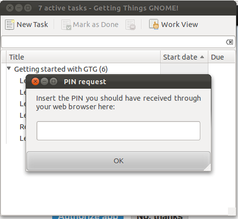
***************************A new concept in the latest GTG is backends. You can synchronize your tasks with services like Google Tasks, Remember the Milk. Those services requires authentication in the browser (most of them). The current workflow is:
- Open Edit->Backends and add new backends
- Click on Allow syncing
- In the task browser gtk.InfoBar is shown (see 01.png) and furter action is required like entring pincode (see 02.png)
The process is quite cumbersome. Maybe authentication should be part of add backend dialog and not clutter browser interface.
Nevertheless we need some form of communication from backends to user, mostly about errors:
  * a service require new authentication like revoked permission
  * backend was disabled because of lack of network
* backend was disabled because other programs does not response, e.g. Gnote see https://bugs.launchpad.net/gtg/+bug/932877
Is it okay to show gtk.Infobar with the error message and a single button which dismiss the InfoBar and open that backend's settings? Should be those messages stackable (in case of failing multiple backends show all warning at once) or show just single one, dimiss it and show another one? What is GNOME policy for that? Could you create a mockup for that?
*Sidebar:*
I think the Sidebar should be enabled by default, since it's a very
powerful feature and there is enough horizontal space to display it. I
also increased the size of the items in the sidebar to 28px, which is
the recomended minimum size of touchable buttons stated by the Noika
Developers Guide. Google also uses this size for sidebar entrys in the
new Google Mail layout.
In the current GTG, the sidebar is hidden by default to give look of very simple UI on startup. It is advised to turn it off in the initial tasks tutorial. However, I haven't seen anybody to use GTG without it because it is very powerful also for newbies.
I vote for making sidebar the default par of UI and getting rid of option to turn it off.
*********************

GTG allows you to stack tags. You can have hierarchical tags:

@Work
 - @project1
 - @project2
@School
 - @courseA
 - @courseB

Could you create a mockup of such an advance usage?

********************
Get rid of "All tasks" and "Task without tags" (they should be shown in special view). In the sidebar should be shown only tags and smart tags a.k.a saved searches (read later).
There was a request for allowing to select multiple tags and creating a context, e.g. I select @call and @work to see all work-releated calls. If no tags are selected, all tasks are shown.
The question is if we want to implement intersection or union of tags. After having a jabber chat with Ploum, we figured out it is hard to choose which way to go. In each way, we would like to have multiple selection in UI.
*********************I can't see the icon assigned to @work. Is it smaller when it is shown next to the text title?
*********************I love your mockup of tag editor! There is a request to create permanent tags (shown although no task is assigned to it). Having another checkbox wouldn't be a problem.
**
*
Tasks:*
I'm struggling with the design of the tasks since i began working on the
GUI, so please don't consider this anything but far from completed.

Although iOS nor Android or any other touch-optimized OS seem to use
tree views, i think we should stick to it, since they are great for
visualizing hierarchy. I'm not completely satisfied with the design of
the tasks, so if you have any ideas how to improve the visual design of
the tasks, please feel free to tell me.
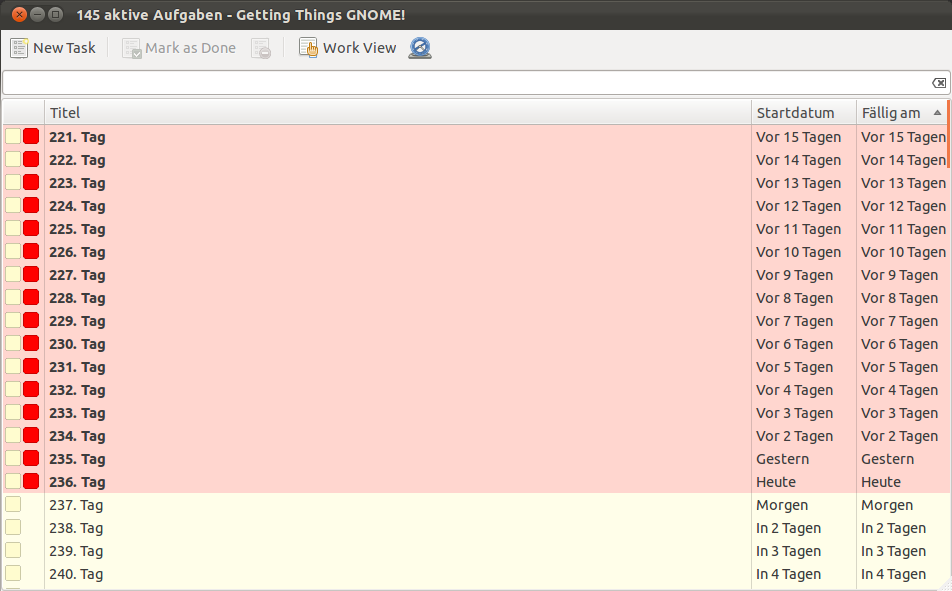
Ploum asked:
> Now, playing devil's advocate, I want to point out that each task
> take a lot more room than with the current GTG version. It means
> that you can display only half or the third number of tasks.
>
> Is this something acceptable or should we have a "thin mode"?
In my opinion, it would be feature of GTG. I have the GTG browser window of a normal size for my laptop (920x591) and I can put there about 20 tasks. (See 04.png) When I do my daily planing, I check several times how my schedule looks like. Unconsciously I end up with the full window of tasks because adding one more task is just about few pixels. When I constrain it consciously, it feels like I underestimate myself: Look fool, you have only the half window to do today, you have enough time to check news again...
GTG could display about 6-8 tasks in the same window. Given "rule 7 +-2", humans (at least I) have problems with dealing many items at the same time. We would force the user to categorize tasks into smaller chunks (or to store less tasks). I personally believe that GTG's (and other ToDO lists) core feature is filtering: show me only the relevant tasks I can work on given the context.
*********************************

There was proposed feature to group tasks by due date:
https://bugs.launchpad.net/gtg/+bug/340022
IMHO it is not quite possible to do with the list of hierarchical subtasks: I could have a task with one subtask due today and another subtask due tomorrow. Should I put the whole subtask to today chunk or tomorrow chunk? Should I split those subtasks although they belong to the single task?
*Quick-Add/Search Bar:*
The Gnome HIGs have very strict requirements regarding the search (see
https://live.gnome.org/Design/HIG/Search. To quote the HIG:

"Typically, the search entry field should be located out of view, at the
top of the list or grid content area. The search field can be accessed
in three ways:
- Scrolling the content up when it is at its apparent upper limit.
- Using the standard search keyboard shortcuts - Ctrl+F or Ctrl+S
- Typing when a text input field is not focused - this text should be
automatically entered into the search field"

If we follow the Guidelines, we have to abandon the search functionality
from the quick-add toolbar. The current idea is to get completly rid of
the quick-entry text input filed and show the user a empty task, which
can be filled out, instead.
In GTG 0.2.9 there was added concept of searches. You can search by entering a query in a simple query language. Look at the comment there:
http://bazaar.launchpad.net/~gtg/gtg/trunk/view/head:/GTG/core/search.pyJoao worked on Search dialog where you could set it up from UI. In the end of summer we came with the idea of "Awesome bar" where you just write your query. As you know, we are going to get rid of "Awesome bar" and therefore the question is if we would like to have a complicated dialog with many options or users enter just a query. Query might be more geeky solution but on the other side:
  - it would provide cleaner interface
  - most user would use it only to find tasks with certain words or tags
  - only a fraction of users would need special operators
I personally see the clean, Google's searchbar interface :-) I don't know about any GNOME application which would provide advanced search feature besides e-mail clients like Evolution or Thunderbird (their interface is very clumsy :-(
We allowed to create smart tags a.k.a. saved searches. You write complex search queries like '@gtg !before 2011-05-01 !not "feature request"', it would be saved into sidebar and you can give a name to it, color, etc. It is like a normal tag but you can specify a query for it.
One of ideas was to automatically save every search. User can rename a search, update query or delete it. We could purge those searches automatically (remember just last 5; forget them after restart; - of course, you could pin them to make them permanent like it is in tomboy's notification area) or let user to delete them manually.
Searches are quite new concept.

I would propose Search dialog to be:

-----------------------------------------------
|         ____________________________        |
| Query: |____________________________| help  |
|                         _________________   |
| ☑ save it as smart tag |_________________|  |
|                                 --------    |
|                                | Search |   |
|                                 --------    |
-----------------------------------------------

Where help would be a link/would open documentation of search query.
If user choose to save the tag, it would be shown in the sidebar in the same way as in the current GTG (see 03.png)
*
Opening & editing tasks:*
I haven't done a mockup of how tasks should be edited yet, but my idea
was to get rid of the 'one-window-per-task' appraoch wich works great on
the desktop, but could cause some problems on small touchscreen devices.
I think it would be nice, if GTG would handle tasks, like other Gnome 3
core apps handle files (See
https://live.gnome.org/Design/HIG?action=AttachFile&do=get&target=index2.png
<https://live.gnome.org/Design/HIG?action=AttachFile&do=get&target=index2.png>).
I agree that editing only one task at the time could be better.I think the overall layout of the current editor embedded in the main window would be okay. In the top toolbar there could be buttons:
 - back (show previous open task or task browser)
 - go to the parent task
--------------------
 - mark as done
 - mark as dismissed
 - delete
----------------
 - insert tag
 - insert subtask
------------------
 - <plugin buttons like Hamster - start tracking this task>

On the bottom toolbar:
 - start date widget
 - due date widget
 - text information: how many days are left

In the context many would be those options:
 - spell checking
 - open link ( if clicked on link )
 - basic rich text operations: make text bold/italic
 - insert tag
 - insert subtask


****************************************************
While writing this e-mail, I got your other e-mail. Most questions are answered above.
- should we stick with the 'empty-task-approach?I think that the empty-task at the top should be just one line Entry widget. If you have a complex widget like in your last mockup, it doesn't make any sense. You can't fill it just from keyboard easily and you have to use mouse or <tab> button. It means you degrade to a form on very small place. The main purpose of QuickAdd toolbar is to quickly and easily add many task (optimally with their structure) from keyboard.
- what do you think of the task design? (3)

I prefer the style from this mockup: http://i.imgur.com/X3zB5.png
I love the title idea form that mockup! The title could help users to understand concepts of filters (you seen text description of what you see).
********************************************************

That's pretty much it. Looking forward to your answers,

Izidor
P.S: What software do you use to create those mockups? Gimp, Inkscape with some plugins or something else? I would like to create some my own modification instead of ASCII art...
Attachment:
01.png
Description: PNG image
Attachment:
02.png
Description: PNG image
Attachment:
03.png
Description: PNG image
Attachment:
04.png
Description: PNG image
| Thread Previous • Date Previous • Date Next • Thread Next |