| Thread Previous • Date Previous • Date Next • Thread Next |
Hi Alex,
 From my current point of view, i see two possible directions for GTG:
1. Light and simple To-Do App (like Wunderlist)
2. Powerful and feature loaded Task Manager (like Producteev)

Considering our opportunities, i would say, that option #1 is the one to
go with.
AFAIK, Lionel and Bertrand's original goal was #1. I would also say that is the way to go. However, some features and power could be added as a plugin.
If we want to compete to other To-Do Apps for linux, we have to focus on
two things:

1. Fluent integration in the Gnome 3 desktop
2. Easy syncronisation between GTG and external To-Do Apps.
We talk on features/wireframes level, don't we? I completely agree with you. The internal side of synchronization must be reworked to be as easy as possible, I am working on it. I see it more the problem of underlaying layout of GTG and not so big problem of UI.
Allen (Day) wrote me a few days ago and he said that the app name
"(Task) Manager" would make him think of work. Maybe we should simply
call it "To-Do" instead?
I agree, there is already a bug for it: https://bugs.launchpad.net/gtg/+bug/962649
The manifesto goal #1 states, that "it makes sure you never forget
anything and you never miss a deadline.". This is not the case, since i
have to remember to open GTG in order to get remembered of my tasks. I
wouldn't call this "never".
I think GTG needs a deamon, which starts on computer startup and tries
to remind you of your tasks, even if GTG is not opened. This deamon
should be fully integrated in the Gnome 3 Desktop. It should show you
your next Tasks in the calendar applet and it should be able to make
notifications 30 to 60 seconds after the computer start.
Amazing idea! I would love it to use! GTG includes separate code for the daemon but it still communicate directly to those parts. We are waiting with the total split and I think implementation of a new design is a great opportunity for that.
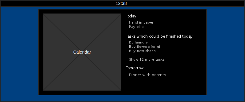
I propose to show first N tasks directly in the calendar window and a link to the show other tasks in GTG. (see calendar.png)
Should it be integrated with regular Calendar window which also has Today, Tomorrow. It might be confusing to see those categories twice next to each other.
Implementation question: Would it make more sense to have it as an GNOME extension or real notification daemon? My guess is GNOME extension with GTG running in daemon mode would be more appropriate. (I haven't written any extension yet)
The first wireframe shows the new start screen (Summary), which aims to
achive manifesto goal #2 "Focus on what's relevant" and goal #4 "Avoid
procastination".

The start-screen contains information about the most relevant tasks
depending on your time and deadlines. It should also show something that
motivates the user to get tasks done. The start screen provides an
overview of my current situation. I can easily see how much tasks i
should do today and how much I've already completed. It could also
contain some motivational phrases.

The Start Screen concept isn't finished yet, because i've read a nice
book about game machanics and want to try to get some of these into GTG,
to make it fun to complete tasks.
Having game mechanics in GTG, yay! There was some discussion about start screen. It seems to be a good idea but nobody convinced me what should be on start screen. (I also don't have any idea) GTG should have start screen only if it adds something cool / important. Otherwise it goes against the simple direction #1. It would add a step to show the list of tasks what is the most important feature of GTG. We need to work on statistics/nice graphs but maybe not as a start screen.
The second wireframe shows normal state, with primary toolbar (top)
tag-sidebar (left) and plugin-toolbar (bottom).

*Inbox View:* The Inbox-view contains all tasks, imported from other
to-do programms, such as Remeber The Milk etc. If you add notes, assign
dates etc. the tasks get moved out of the inbox.
So the Inbox would replace Tasks without Tags? (Which I and few other people abuse as an inbox) More cleaner way would be wait until user edits a task for the first time. I see a possible confusion: I open a task, make a first edit, switch to another task to check a detail and want to make a second edit on the task but it is not there. Would it be worth the risk?
I propose to get rid of special tags "All Tasks" and "Tasks without Tags" and make other tags as a checkboxes to select one or more tags.
Just an Idea:
It would be great if you would be able to send yourself emails with a
special subject (e.g. "@GTG: My Task") which would then land in the
Inbox for further editing.
Synchronization with e-mail is in the plan, coming sooooooooooon :-)
*Focus View:* The Focus-view behaves like the current work view.
*Scheduled: *This view shows you all your tasks in a chronological order.
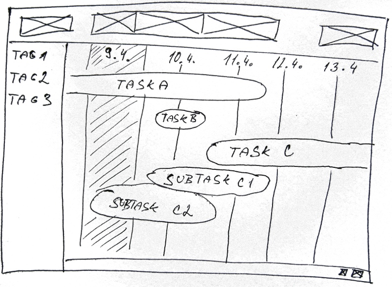
I would like to propose a special representation of tasks for this mode. Instead of showing them as list items, I makes more sense to have a timeline, Gantt diagram or customized calendar.
The use case: I want to find what I have to work on/how busy I am on week 15. (Goal #2: "Focus on what's relevant")
Gantt diagram in Planner:
https://live.gnome.org/Planner/Screenshots?action=AttachFile&do=get&target=gantt.png

My wireframe: see timeline.jpg

We would have to create this widget ourselves.
Since i wanted to focus on synchronization-abilities, i moved the
sync-button to the right side of the primary toolbar. If you klick on
this button the first time, it will open an account selection dialog,
where you can enter your account details of external services. It should
maye show some text, which explains all the sync-stuff and tell you,
that you can add more accounts later in the options.
Do you think that synchronization is so important that it need a button on the main toolbar? I opened that dialog only few times to setup synchronization and then forget about it. In the optimal case, synchronization should work without explicit request from user (i.e. synchronize every 10 mins) and it would mean to give the user really expensive "save" button - every service has limited number of API requests.
The idea is, that GTG would handle tasks, like other Gnome 3 apps handle
files. If you click/tap on a task, it will open the edit-view, where you
can edit your tasks, set another title, tags and dates.
I am against having special fields for Title and Tags. What makes GTG so special is great editor which is simple to use with keyboard. There should be buttons for managing tags, subtasks but not special fields for Tittle and Tags.
I miss "mark as done" button. It could be on the right side of the toolbar.
My current approach is highly "inspired" by Gmail, but i think this is a
very nice way to display the tasks.

The hight of a single task should be around 40px, so its easy to target
on touch devices. The first three buttons are "Mark as done", "Priorize"
and "Expand/Collapse". I hope the rest oft the design is
self-self-explanatory.

For the sub- and sub-sub-tasks, i  used darker shades of grey, to
symbolize, that you are going deeper in the hirarchy.

I know, there is no extra place for a starting date, but if there is a
starting date assinged and the task hasn't started yet, we could just
display "Starts at:" instead of the due date.
That design was almost achieved in the current GTG :-)When the high of a single task should be around 40px, why not split the task and show it on two lines? It would make more space for preview text, start date could be also shown. 20px for a line should be enough.
At the first glance, I didn't realize the color of subtasks and neither it's meaning. The background color of subtasks should be reserved for mixing from tags what is a killer feature for some people (Lionel loves it and won't let to get rid of it). Another meaning of background color might be a status of task: Due today (over due), active, done, dismissed.
What about using drag and drop for prioritizing instead of a button? Using drag and drop would: * result in a finer precision - I would like to done this task before another * it is more natural to decide if a task is more important than another one than say this task has priority 1, 2, or 3 (it could be still done as a tag)
  * save space and clutter in UI

Thanks for your mockups.

Izidor
Attachment:
calendar.png
Description: PNG image
Attachment:
timeline.jpg
Description: JPEG image
| Thread Previous • Date Previous • Date Next • Thread Next |