gtg-contributors team mailing list archive
-
 gtg-contributors team
-
Mailing list archive
-
Message #00943
Re: Redesign: Mockups and Stuff (Round 2)
Hi Alex,
The mockup is awesome. It did get refined as compared to the previous ones.
Well, I was wondering, if we could have a search bar right somewhere in h the right side of the main top bar. GTG needs an efficient search bar, and since you have included Saved Searches in the sidebar, the search bar should even be visible prominently.I also had a doubt as what is the function of Inbox?
I'm also looking forward to the text editor mockup.
Anant
Date: Fri, 13 Apr 2012 21:42:49 +0200
From: alba@xxxxxxxxxxxxx
To: gtg-contributors@xxxxxxxxxxxxxxxxxxx
Subject: [Gtg-contributors] Redesign: Mockups and Stuff (Round 2)
Hey everyone,
today, i was in the mood to do some mockups. I tried to take all
your proposals in consideration and focus on synchronization and
collaboration. I'm not finished yet, but i wanted to give you an
update.
First of all, i want to make another proposal. GTG currently uses
the "@" to define tags, and having in mind that Bertrand would like
to see collaboration-features, i think it would be better to do it
like twitter and many other applications and use "#" to define Tags,
and "@" to assign tags to people.
For example: Write @Angela to do sth. #Work #Important
BTW: I wouldn't use "Context" instead of "Tags", i'm not a native
english speaker, but i think "Context" might be confusing. The word
"Tag" is used by so many other applications as well, just think
about twitter (almost everyone knows what a hashtag is).
If you really want to get rid of "Tags", maybe we could use
"Labels"?
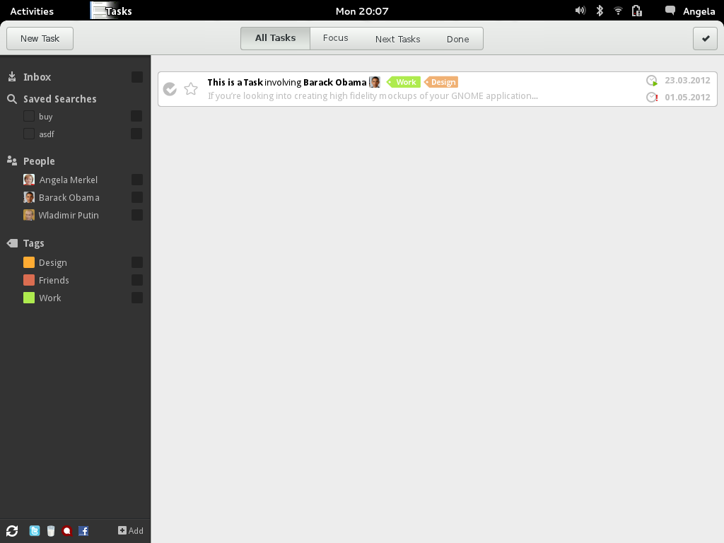
The most obvious change is the dark sidebar. I've made an other
mockup with a white sidebar (see light.png), but this led to too
much visual clutter. In my opinion, the whole interface is much more
calm with a dark sidebar.
I also switched back to another font, because i hate the standard
"Sans" font and i think it's ugly as hell.
View/Filter Controls:
I designed the controls in the primary toolbar to filter by time and
importance, and the controls in the sidebar strictly to filter by
tags and persons.
Sidebar:
- Inbox (All Tags)
- Saved Searches (I'm not satisfied with the default icon of the
saved searches, any ideas?)
- Tags (I'll add Groups or Folders where you can group tags
tomorrow)
- People
Primary Toolbar:
- All Tasks
- Focus (or Workview)
- Scheduled (or Next Tasks)
- Done
Sidebar:
Apart from the new filters, i placed a small "sync-box" at the
bottom of the sidebar. The Sync-Icon is intended to spin, when GTG
is currently synchronizing. It shows you all the services which you
are connected with and gives you the option to add another account.
Tasks:
- I'ts a 2-Row Task again.
- I retained the star for priorizing tasks, because i think, having
visual feedback is really important, especially if you have 20+
tasks. Drag&Drop and this button are not contradictionary, so i
think we should implement both (If you drag a task to the top, the
star would get yellow as well).
- Icons for start and due-date (do you think their meaning is
clear?)
To-Do:
- Clalendar View
- Maybe another Summary-Page attempt
- Groups/Folders for Tags
- Edit-View
P.S.: Maybe, I'll get access to the github repo this weekend, so you
can get my .xcf files. I have to warn you though, i'm not too
ambitious in naming the layers :-)
Thats it for now, let me know what you think,
Alex
_______________________________________________
Mailing list: https://launchpad.net/~gtg-contributors
Post to : gtg-contributors@xxxxxxxxxxxxxxxxxxx
Unsubscribe : https://launchpad.net/~gtg-contributors
More help : https://help.launchpad.net/ListHelp Attachment:
dark.png
Description: PNG image
Follow ups
References