kicad-developers team mailing list archive
-
 kicad-developers team
-
Mailing list archive
-
Message #11514
Re: KiCad look (the icon situation)
Dear Jean-Pierre,
I agree, updating documentation is such a pain when icons change and I
actually remember spending a long time on it. That is why I actually
let 2 years pass. I think 26px icons changed and improved a lot how
KiCad looks.
The thing is that from a graphical point of view the current KiCad
icons are a little bit a mishmash of colors and styles, I think it
would be good to make them belong to the same theme. More or less the
same thing was done with Tango icons for Linux.
Original Icons are vector-based SVG icons but unfortunately that does
not mean that they can be resized on any resolution. when you do a svg
to 26px png conversion and the svg icon has a vertical line that is
larger than 1/26 the width of the svg icon the result is a fuzzy
vertical line. This is a very well known problem in the graphic design
world and re-touching manually the PNG is always a must.
In the work for KiCad I did adjust each of the 460 icons but I have
not really done a great job because of the limited time (=large number
of icons). So some icons need to be fixed. However, what I cannot
really do is to maintain 460 icons, that is why I proposed to drop the
drop down menu ones.
So here we have two problems: 1) some icons are fuzzy, 2) many icons
are a mishmash of styles. Fixing both is hard but possible and would
give to KiCad was it is often perceived as a professional looking
software tool (like gEDA for instance)
To ease this transition I am offering to update some of the English
documentation too. I would ask the people who appear as maintainers of
the various non English docs to take care of their portion.
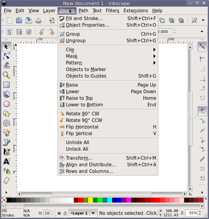
Regarding the icons in the drop-down menus, I of course see the
advantage of having additional info next to the menu item. I am a
great fan of it but if you like it to be done, it is necessary to do
it as it is normally done, for instance, in inkscape, see attachment.
icons in the drop down menues are smaller.
Some of the icons that Konstantin has made are much better than what we have.
In my opinion we could start by slowly update 5 or 10 icons each time
beginning from the most critical ones (e.g. Pcbnew left side)
Cheers
Fabrizio
On Thu, Oct 24, 2013 at 8:32 PM, jp charras <jp.charras@xxxxxxxxxx> wrote:
> Le 24/10/2013 11:42, Fabrizio Tappero a écrit :
>> Hello,
>>
>> About 2 years have passed since KiCad got its new look with the 26px
>> icons. At that time approx 400 icons had to be redrawn/resized/reused
>> etc. It was a lot of fun!
>>
>> I'd like to propose a new round of changes to give to KiCad a new
>> polished look so that we can have the best looking EDA tool in the
>> world!!
>>
>> Before any further do I'd like to ask what people think about some issues:
>>
>> 1) 400 icons are hard to manage and maintain. I would warmly propose
>> to drop all icons in all drop-down menus. The use of icons there is a
>> little bit old style and not really used any longer in modern GUI
>> design.
>>
>> 2) I every now and then hear about people wanting smaller icons, maybe
>> large icons, movable icon toolbars, toolbars that re-size with the
>> screen size. What do we feel about that?
>>
>> 3) monitor pixel density (pixes per cm) in slowly increasing, this
>> means that what was big icon two years ago now is a small icon. Do we
>> want more than one size of icons.
>>
>> 4) Is there any input from OS X users? OS X is known to be a prettier
>> place, would be great to aim at getting there.
>>
>> 5) looking at the looks of other PBC CAD tools what can we change to
>> make KiCad better looking? For instance do we think gEDA/whatever has
>> a better appearance? What can we copy? Where can we get inspiration
>> from:
>> http://chitlesh.fedorapeople.org/FEL/images/pcb.png
>> http://www.expresspcb.com/GSoftware/SShotExpressPCB_3.gif
>> http://www.printedcircuitsboards.com/wp-content/uploads/2009/04/osmond-pcb-design-software.gif
>> http://www.diptrace.com/img/dpict1_l.gif
>> http://www.ianstedman.co.uk/Technical/PCBs_and_Eagle_CAD/Eagle_CAD_fill_isolate.png
>> http://masalaboratory.c.blog.so-net.ne.jp/_images/blog/_c23/masalaboratory/olimex_pcbcad1.png?c=a1
>>
>> In my opinion the appearance and user friendliness of the KiCad GUI is
>> good but not great. Hence this e-mail
>>
>> 6) Big topic but.. what do we think about tabs:
>> http://morphesys.com/images/Portfolio/CAD/pcb4.jpg
>>
>> 7) some icons are quite mysterious and the association between what
>> they do and how they look is probably known only to the guy who made
>> it. Which icons are those?
>>
>> 8) is there an amazing PCB CAD (or graphic software) out there that
>> has amazing icons? Any futuristic look anybody has in mind?
>>
>>
>> Any suggestion is welcome.
>> Cheers
>> Fabrizio
>
> Fabrizio,
>
> Certainly, some icons should be enhanced.
> *But keep in mind changing icons means also changing the full Kicad
> documentation*.
> This means a *lot* of work.
>
> Therefore We should be careful when changing icons.
>
> To tell the true, icons shown from your links are poor.
> Not sure they give us inspiration.
>
> Resizing icons is a matter of compil options.
> No need to change them for this reason.
> They are (thanks you) created in svg form, not in pixmap, and are
> therefore easily scalable.
>
> However, about icons, there are *a lot of enhancements* which to be made
> in Kicad:
> I am mainly thinking about icons which explain options in many dialogs:
> For instance, in zone options, an icon which shows what is the thermal
> relief options, the anti-pad value, the spoke value, and so on.
> Also, what is a micro via, a blink/buried via ...
> There are *many dialogs* which will be better with some icons which
> explain what happen when an option isselected.
>
> Trust me, there is a lot of work about this, and Kicad will be great
> only if this kind of icons exists in dialogs, not if existing icons are
> changed.
>
> By the way:
>>I would warmly propose
>> ...
>>to drop all icons in all drop-down menus. The use of icons there is a
>> little bit old style and not really used any longer in modern GUI
>> design.
>
> Menus without icons are I saw many years at the beginning of Windows.
> Therefore, I am some trouble with "no icons in modern GUI design" idea.
>
> Be *very* careful with "modern GUI design".
> Do not try to mimic what other guys are doing, unless you are convinced
> they have really good ideas.
> (Take only good ideas, leave bad ones)
>
> Thanks for your involvement in Kicad.
>
> --
> Jean-Pierre CHARRAS
>
> _______________________________________________
> Mailing list: https://launchpad.net/~kicad-developers
> Post to : kicad-developers@xxxxxxxxxxxxxxxxxxx
> Unsubscribe : https://launchpad.net/~kicad-developers
> More help : https://help.launchpad.net/ListHelp
Attachment:
Screenshot - 10252013 - 01:52:31 PM.png
Description: PNG image
Follow ups
References