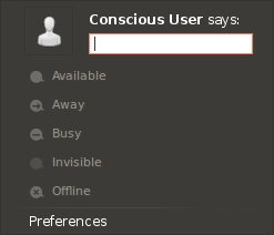
Hello,

So I've been thinking: a big problem with the Me Menu
comes from the fact that there is not an universally
recognized word for the act of microblogging. There
are "tweets", "dents", and Facebook made the rather
poor choice of using "status updates" (increasing
the confusion with IMs)

One thing that is universal, though, is how they are
displayed: picture on the left, message to the right
with the name in bold. So why not take advantage of
the familiarity of this layout to make the purpose
of the broadcasting field more evident? See the
attached mockup.

One of the reactions to the mockup will be "we don't
have the menu item for customizing About Me anymore".
Well, quite frankly, it is a "Preferences"-like
item. Isn't those things supposed to be accessed
quite rarely after the first setup? The same goes
for the two "accounts" items in the bottom, is it
really necessary to keep them there all the time,
cluttering the interface?

Thinking about that, and considering consistency
with the sound indicator and the power indicator,
I think it's better to just merge all those things
in a "Preferences" item at the bottom.

You will also notice that I added a "says:" to the
broadcasting field. I thought it might be a good
way to differentiate broadcasts from IM custom
status, which are more like temporary descriptions.
But I'm not entirely sure on this one.

Thoughts?
Attachment:
mockup.png
Description: PNG image