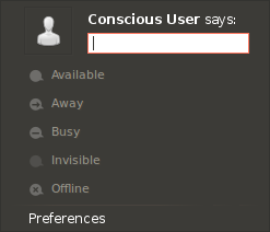
One thing that is universal, though, is how [tweets] are
displayed: picture on the left, message to the right
with the name in bold. So why not take advantage of
the familiarity of this layout to make the purpose
of the broadcasting field more evident? See the
attached mockup.
Wow. This is the single neatest suggestion I've seen on the Ayatana list. I particularly like the echoing of standard web presentation in the menu, to cue users as to the purpose of the field.
The rest of the thread has further good ideas, so I'm not +1'ing this mockup as a final position, but wanted to call it out as a *great* bit of thinking and mocking-up.
You will also notice that I added a "says:" to the
broadcasting field. I thought it might be a good
way to differentiate broadcasts from IM custom
status, which are more like temporary descriptions.
But I'm not entirely sure on this one.
I think the "says:" piece is unnecessary and a little blunt. We can address the IM custom status requirement separately (for example, putting a text field inline there too).
Mark
