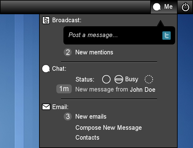
Here's a mockup.On Mon, Oct 4, 2010 at 4:40 AM, Matthew Paul Thomas <mpt@xxxxxxxxxxxxx> wrote:
Perhaps someone could
sketch what a combined menu might look like?
The only thing I'm not happy about in it are the chat status buttons.
Most likely as i believe, Sound Menu will remain the exception concerning horizontally arranged menu items.
It would be easier to develop horizontally arranged elements, if there was a consensus on when and how that would make sense consistently for any indicator menu at all.
