| Thread Previous • Date Previous • Date Next • Thread Next |
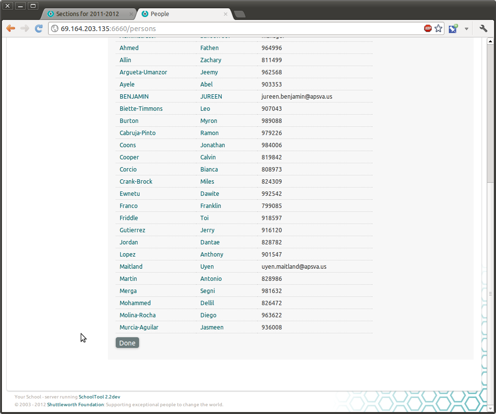
One paper cut in our 2.0 UI redesign is the "Done" button.  Basically,
there are a lot of views where you're just viewing something, and when
you're done, you probably want to go back to where you came from (if
you don't have a reason to follow any of the other links on the page).

Initially I wanted to minimize this general pattern by using more
javascript pop-ups (so that you'd return to the previous context just
by closing the javascript window.  Regardless of the usability merits
or demerits of this approach, it was proving to be too time consuming
to implement widely, but it remains an option in particularly
troublesome places.

There are a few sub-issues here:

Text:  "Done" doesn't seem perfect (or very standard).  "OK" is more
obvious but it implies approving something, which we don't want to
imply.  "Return" is another possibility which doesn't seem any more
standard than "Done."  At this point, I think we're sticking with
"Done."

Link/Button Design:  Right now "Done" is just a link.  This is not
prominent enough.  Attached are screenshots showing it as a button.
We could also make it a button styled differently and placed apart
from the regular form buttons.

Placement:  This is a pain because frequently we have pages with a
fairly long list of search results (say, a batch of 25), so putting
"Done" at the bottom puts it off the screen.  So we've been trying to
put it above the result tables.  Maybe this isn't necessary.  Attached
is one shot with Done as a form button -- placed next to another form
button; another with the Done button at the bottom.  There is no
particular reason we couldn't put it both places.

Thoughts?

--Tom
Attachment:
Screenshot from 2012-06-28 11:51:01.png
Description: PNG image
Attachment:
Screenshot from 2012-06-28 11:50:48.png
Description: PNG image
| Thread Previous • Date Previous • Date Next • Thread Next |