software-store-developers team mailing list archive
-
 software-store-developers team
-
Mailing list archive
-
Message #00111
Re: Rearranging the software item screen
On Tue, Jun 28, 2011 at 9:45 PM, Matthew Paul Thomas <mpt@xxxxxxxxxxxxx> wrote:
>> Perhaps we could add something else (e.g. reviews or recommendations)
>> below that?
>
> I don't know what else would practically fit in that space. (Even some
> package names would already be wrapped.)
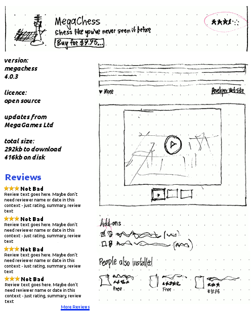
Yeah, I was thinking we could split the horizontal space into a 1/3rd
section and 2/3rd section. So the 'margin' is less of a margin and
really just a smaller vertical column section (see mockup) but the
'main' stuff (video, description, add-ons) is still big enough to show
it's the focal point.
> I'm interested in seeing that mockup. :-)
See attached.
Disclaimer before you open it: As a mockup designer I make a good
developer (which, ironically, may be the only time I make a good
developer!) and I have stolen most of it straight from mpt's design
just hacking together the bit that I'm trying to highlight and
changing the proportions.
I'm thinking the only relevant information to someone trying to make a
decision on whether to install the software should be displayed. They
can use the reviews to immediately glance and make a decision, without
having to take in too much info - so we can reduce the clutter in the
reviews area by only including rating, summary and text (perhaps only
4-5 lines with a 'more' expander link) at this point.
Then, if the user clicks on 'More Reviews' at the bottom, we then
perhaps open up a much wider section on the screen (maybe under the
Add-On section) which includes these reviews (and others) in their
full form with the user's name, date submitted, usefulness factors
etc.
Just a thought, open to criticism (and ridicule).
cheers
Aaron
Attachment:
usc-mockup-29062011.png
Description: PNG image
References