| Thread Previous • Date Previous • Date Next • Thread Next |
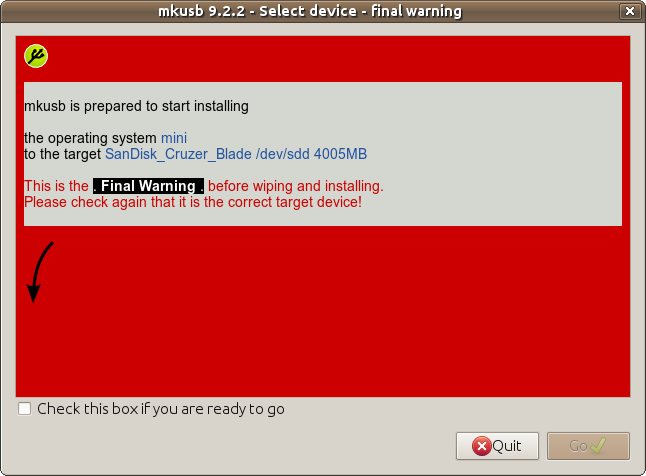
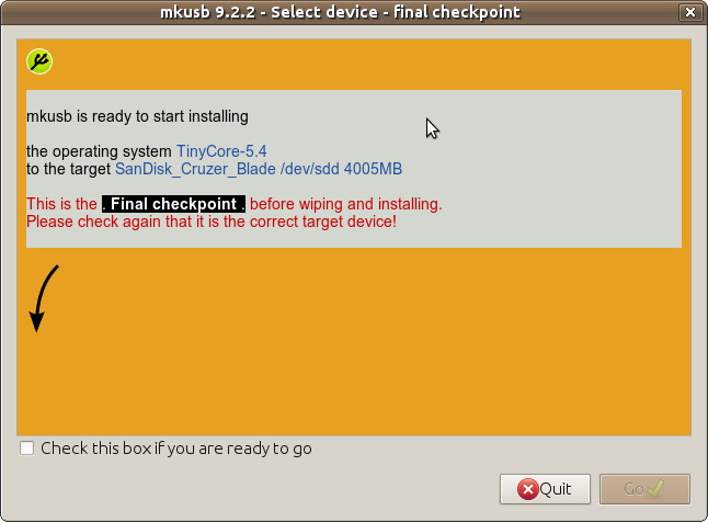
Hi ToriOS developers,

ventrical at the Ubuntu Forums is helping me to improve the look and
feel of mkusb. He has suggested several changes of the text in the
zenity windows, and he also wants me to change the red warning
background of the 'final warning' window to a colour that is nicer for
the eyes. He suggested blue, but it is not a warning colour, so I'm
testing an orange background of a 'final checkpoint' window.

See the attached files, and also the following link, where five
screenshots are attached (and read the discussion above and below that
post at the Ubuntu Forums)

http://ubuntuforums.org/showthread.php?t=1958073&page=5&p=13330888#post13330888

mkusb is part of ToriOS, and it is important to get feedback from you,
so that we do not change mkusb in a way you think is wrong. Maybe
everybody will not agree, but it is important for me to make the look
and feel as good as possible, and to understand why it is changed or not
changed.

Best regards
Nio
Attachment:
final-warning.png
Description: PNG image
Attachment:
final-checkpoint-orange.png
Description: PNG image
| Thread Previous • Date Previous • Date Next • Thread Next |