unity-design team mailing list archive
-
 unity-design team
-
Mailing list archive
-
Message #01308
monochrome applets vs user experience
after testing lucids alphas and betas, while one of my machines still runs
karmic for comparison, the new design became very soothing to my eyes..
some usability points came to my perception, which i would like to share:
*bluetooth should be blue while active, should be disabled by default.
*nm applet doesn't indicate presence or status of 2nd wifi adapter in icon
*volume indicator doesn't indicate capture (see link below)
*message indicator changes size and design upon new incoming
i was alerted to https://lists.launchpad.net/ayatana/msg01195.html in
respect to the topic i'm addressing here.
BT applet:
bluetooth should indicate its activity in BT tray icon, since bluetooth
enabled devices usually consume extra power if it's on. also does bluetooth
make a machine discoverable within a radius of sometimes up to 20m. we want
to be aware of this. blue as informative color would be clearly the color of
choice here, if that is not already obvious enough by the name and branded
color of the protocol's icon. a disabled bluetooth may well share the
default color of the other applets / indicators.
NM applet:
i connected a WLAN dongle in addition to the integrated WiFi adapter on my
netbook. successfully created a new Wireless Network and went online with
it. everything worked, only that the "indicator", in this case applet would
be correct, didn't indicate anything about me having 2 Wifi's active on my
box. there was no visual way of understanding which adapter is represented
by the icon. only on mouse hover
volume indicator:
as Luke already envisioned in the thread linked above, red could be used to
signal an active recording process. i use voice memos a lot, once i
accidentally left it running for quite a long time, no indication of that in
the tray. that's a great idea luke presented, which should receive attention
now that everybody is concerned with indicators..
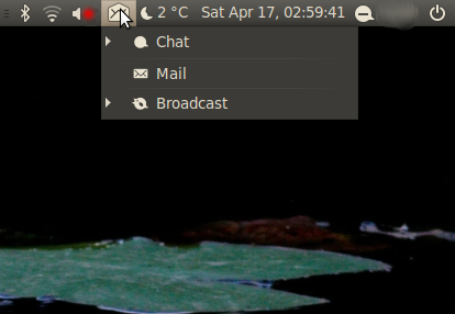
message indicator:
Compose New Message doesn't open my default MUA's compose dialog, instead
always opens Evolution.
Compose New Message and Contacts totally break the consistency and
formatting of this indicator's drop-down ("menu").
they neither have informative icons before them like the other items in this
view do, nor are they indented or hidden under their parent item: Mail.
this is a bit annoying to me, and in the beginning it had me quite confused:
it was not even quite clear, what type of message (IM/Broadcast/email) i was
going to compose.
a "compose message" dialog would be expected here, that allows me to decide
whether i want to broadcast, chat or mail someone.
The little triangles that appear when a client (Mail, IM, Broadcast) is
active could serve to collapse client-related messages as they appear. using
colors, they could indicate the presence of updated information or new
incoming messages, while collapsed.
while i don't know if libindicator can handle any of that, i know that it
would help give these triangles sense, and order the "menu" much better.
otherwise we should perhaps use dots just like in the availability settings
from the MeMenu, for better consistency.
i attached a dirty mockup of how the tray could look, tidy, while recording
a voice-memo and clicking the message indicator.
Attachment:
Screenshot-messages-menu.png
Description: PNG image
Follow ups