| Thread Previous • Date Previous • Date Next • Thread Next |
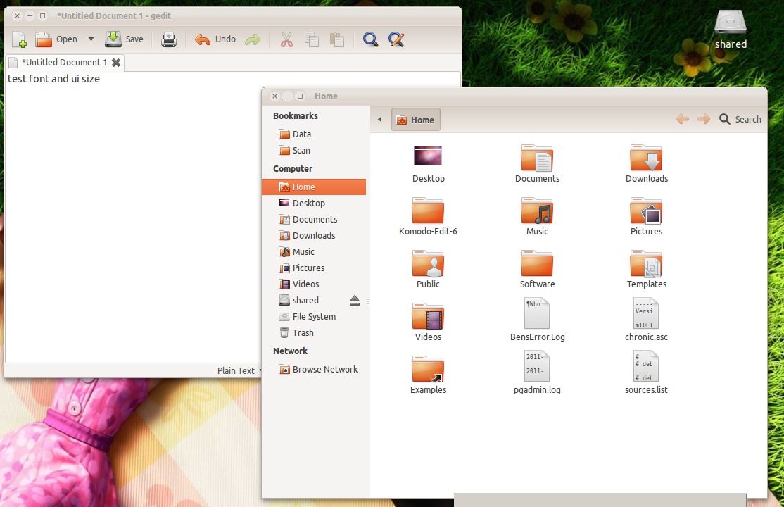
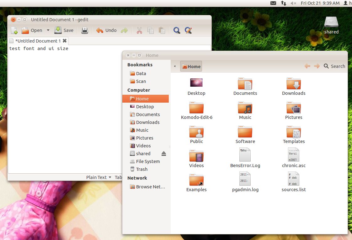
Dear All,

I forgot to give my screenshot, the windows font and ui size in my opinion
is better than ubuntu as you may look in the attached.


Hope this helps.


Kind regards,


/charles
everytime i get ahead, i feel more dead.


2011/10/20 Tomasz Sałaciński <tsalacinski@xxxxxxxxx>

> They are *slightly* harder to read because they're very small (9pt). Ubuntu
> should use Ubuntu 10, not 11. Remember, that such huge font makes working on
> smaller screens very annoying (no window will fit the screen, or will force
> user to scroll/move windows), working on bigger screen makes fonts very,
> very big.
>
> W dniu 2011-10-20 16:34, Ian Santopietro pisze:
>
>> The letters in the Segoe example run together, and in My opinion are a
>> bit harder to read than the Ubuntu example. In addition to this, they
>> look clearer because of improper hinting settings, which detracts from
>> the visual appearance of the characters and also makes them harder to
>> read.
>>
>> 2011/10/20 Tomasz Sałaciński<tsalacinski@gmail.**com<tsalacinski@xxxxxxxxx>
>> >:
>>
>>> I've created such a comparsion.
>>>
>>> First label shows default monospace font in Windows and in Ubuntu
>>> (gedit).
>>>
>>> Second label (Setup is loading...) shows Windows interface font (setup
>>> program) compared to Ubuntu interface font (made in Glade).
>>>
>>> See how much Windows fonts are clearer and take a lot less space than
>>> Ubuntu
>>> fonts. 90% of computer users in the world don't have any problem with
>>> size
>>> that Windows uses (I think they spent a lot more money on research what
>>> font
>>> size they should be using) - let's say 10% of them change the size of the
>>> font. It still leaves 80% of world computer users satisfied (maybe more,
>>> not
>>> counting Macs) with the font we see in Windows. Even with a lot less
>>> userbase MORE Ubuntu users are complaining about font size.
>>>
>>> Imagine when reading a source code file in gedit you have to scroll every
>>> few lines.. then you have to find where you've left reading. It hurts
>>> your
>>> eyes and makes using of computer a simple pain in the backside.
>>>
>>> Of coure - Ubuntu 11 looks fancy. But users will do more than looking at
>>> the
>>> screenshots. If they see that the system is useless except for listening
>>> to
>>> music, watching videos and browsing Facebook - they just stick to using
>>> Windows. With such big fonts and additional padding, windows in Ubuntu
>>> are a
>>> lot bigger than in other systems. If this is by design, then the design
>>> is
>>> simply completely wrong. You can't satisfy all users, but you should try
>>> satisfying most user's needs, instead of personal preferences of the
>>> designers.
>>>
>>> W dniu 2011-10-20 15:00, Thibaut Brandscheid pisze:
>>>
>>>>
>>>> 2011/10/17 Matthew Paul Thomas<mpt@xxxxxxxxxxxxx
>>>> <mailto:mpt@xxxxxxxxxxxxx>>
>>>>
>>>>
>>>>    What would help here is for someone to make a screenshot comparison
>>>> of
>>>>    the same windows, laid out in exactly the same positions, on Ubuntu,
>>>>    Windows, and OS X.
>>>>
>>>>    ....
>>>>
>>>>    We might find that the problem is partly font size, but partly also
>>>>    size and padding of interface controls.
>>>>
>>>>
>>>>  Here are two similar images showing the file browser and text editor
>>>> in Windows 7 and Ubuntu Oneiric.
>>>>
>>>>  * Ubuntu<http://image-upload.de/**image/KUAqjL/28a9103bae.png<http://image-upload.de/image/KUAqjL/28a9103bae.png>
>>>> >
>>>>  * Windows 7<http://image-upload.de/**image/uyfCCE/e1bc89e7fa.png<http://image-upload.de/image/uyfCCE/e1bc89e7fa.png>
>>>> >
>>>>
>>>> Padding (buttons) and font size are smaller and therefore the interface
>>>> looks&  feels cleaner in Windows 7. Thats the reason why smaller windows
>>>>
>>>> seems to be more useful in Windows than in Ubuntu (compared same sized
>>>> windows).
>>>>
>>>> Traditionally GNOME has a lot of padding (negative example → Totem
>>>> controls) and wasts a lot of screen space (has been reduced a bit last
>>>> cycles).
>>>>
>>>> So what to do?
>>>>
>>>>  * Analise every default application UI if they need that big buttons
>>>>    and that much padding/margin
>>>>      o use the same padding/margin in every application if possible
>>>>  * Reduce padding and font size - just a bit → huge difference
>>>>
>>>>
>>>> Kind regards
>>>> Thibaut
>>>>
>>>> PS: If anybody uses Ubuntu, Win&  and Mac and could make more comparison
>>>>
>>>> screenshots it would be awesome.
>>>> I use Windows only for gaming → my Wintendoo ;)
>>>>
>>>>
>>>> ______________________________**_________________
>>>> Mailing list: https://launchpad.net/~ayatana
>>>> Post to     : ayatana@xxxxxxxxxxxxxxxxxxx
>>>> Unsubscribe : https://launchpad.net/~ayatana
>>>> More help   : https://help.launchpad.net/**ListHelp<https://help.launchpad.net/ListHelp>
>>>>
>>>
>>> --
>>> Tomasz Sałaciński
>>>
>>> ______________________________**_________________
>>> Mailing list: https://launchpad.net/~ayatana
>>> Post to     : ayatana@xxxxxxxxxxxxxxxxxxx
>>> Unsubscribe : https://launchpad.net/~ayatana
>>> More help   : https://help.launchpad.net/**ListHelp<https://help.launchpad.net/ListHelp>
>>>
>>>
>>>
>>
>>
>>
> --
> Tomasz Sałaciński
>
> ______________________________**_________________
> Mailing list: https://launchpad.net/~ayatana
> Post to     : ayatana@xxxxxxxxxxxxxxxxxxx
> Unsubscribe : https://launchpad.net/~ayatana
> More help   : https://help.launchpad.net/**ListHelp<https://help.launchpad.net/ListHelp>
>
Attachment:
ubuntu oneiric screenshot - reduced.jpg
Description: JPEG image
Attachment:
ubuntu oneiric screenshot.jpg
Description: JPEG image
Attachment:
windows 7 screenshot.jpg
Description: JPEG image
| Thread Previous • Date Previous • Date Next • Thread Next |