unity-design team mailing list archive
-
 unity-design team
-
Mailing list archive
-
Message #07136
Re: Dash Home Mockup
On Sat, Nov 12, 2011 at 3:11 PM, frederik.nnaji@xxxxxxxxx <
frederik.nnaji@xxxxxxxxx> wrote:
> how do you want the buttons to highlight?
> will the text be within the highlighted rectangle, or will it be outside,
> as it currently is?
>
>
> On Sat, Nov 12, 2011 at 02:43, Evan Lin <hairymonkey.evan@xxxxxxxxx>wrote:
>
>> Here is my mock up of what I think home dash should look like.
>>
>> --
>> Evan Lin
>>
>> _______________________________________________
>> Mailing list: https://launchpad.net/~ayatana
>> Post to : ayatana@xxxxxxxxxxxxxxxxxxx
>> Unsubscribe : https://launchpad.net/~ayatana
>> More help : https://help.launchpad.net/ListHelp
>>
>>
>
> _______________________________________________
> Mailing list: https://launchpad.net/~ayatana
> Post to : ayatana@xxxxxxxxxxxxxxxxxxx
> Unsubscribe : https://launchpad.net/~ayatana
> More help : https://help.launchpad.net/ListHelp
>
>
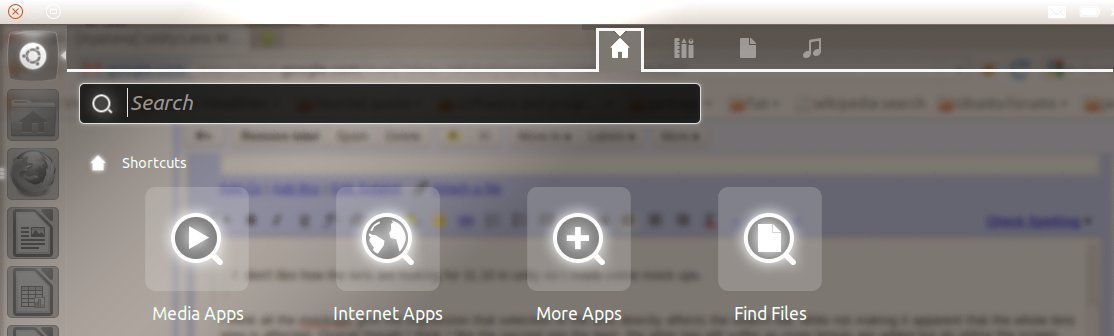
What about having the active lens buttons coloured the same colour a the
main body instead of the search bar: It will give the feeling of modifying
the entire dash instead of being associated with the search only.( Just
feels more intuitive for me.) Please tell me what you think about this
modified screen shot.
Attachment:
LensBarToTopModified.jpg
Description: JPEG image
References