unity-design team mailing list archive
-
 unity-design team
-
Mailing list archive
-
Message #08628
Re: More visible already started/active application in Launcher (for TV/tablets/phones)
Hi.

Your propositions are awansome!

Personally I like to proposition with Glow (by Matt) and same with
backgroundcolor of MenuBar (Gustav).

Maybe we should add this proposition to bug report?

Thank you for great mockups.
Bartosz


W dniu 5 marca 2012 13:09 użytkownik Gustav Sony <sony-qs@xxxxxxx> napisał:

>  Blur-Effect I think is not beautiful if you think about first state
> without open apps!
> Glow-Effect for me is not enough to directly identify as open!
> Shruck would be possible but ends-up with more resizing and breaks the
> straight lines!
>
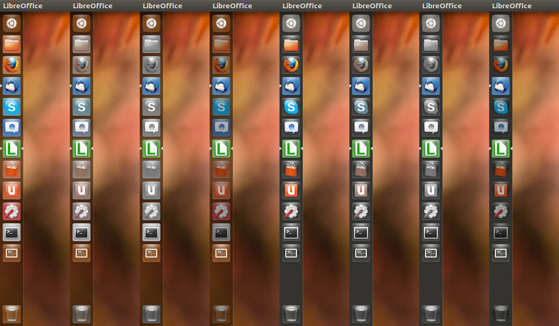
> Desaturate and darken are my favourite prospects: Look at this ...
> Current,     desaturate75,     desaturate100,     darken75,     same with
> backgroundcolor of MenuBar, no transparency and ActiveOnBacklight
> [image:
> http://img194.imageshack.us/img194/5329/ubuntutesticonsoverview.png]
>
> Am 05.03.2012 11:57, schrieb Matt Richardson:
>
> I use backlight toggles and I just tried opening multiple applications
> such that they collapsed. I don't see the problem you're talking about,
> perhaps you could elaborate?
> Personally I think that backlight toggles by default would really help new
> users to define which apps are open.
>
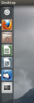
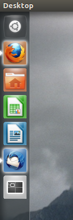
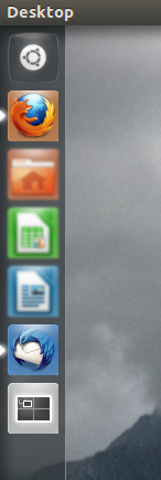
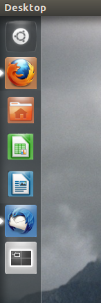
> Four other potential solutions (screenshots below):
>  - Desaturate the non-runnning apps, but not completely.
>  - Blur non-running apps slightly
>  - Shrink non-running apps
>  - Add a shine to running apps
>
> Matt
>
> Current:                 Desaturate:            Blur:
>    Shrunk:                 Glow:
> [image: Current] [image: Incomplete Desaturation] [image: Blur] [image:
> Shrunk] [image: Glow]
>
> On 04/03/12 22:50, Hans Heintze wrote:
>
> On 03/04/2012 04:14 PM, Bartosz wrote:
>
> Hi.
> I think the current indication of started and active application should be
> improved.
> The small arrows on the left/right side is not good visible (especially on
> tablet/phone sceen)
>
>  What is your proposal of improve visibility of the already started
> appplication?
>
>  And how we could improve currently active application?
>
>  I have already filled the bug for that issue:
> https://bugs.launchpad.net/ayatana-design/+bug/917951
>
>  Best Regards
> Bartosz
>
>
>  Agreed. There is a problem with enabling backlight toggle by default
> however, it makes it difficult to distinguish between collapsed tiles. tile
> theming needs to be reconsidered by design and likely redone all together
> for many reasons, including the following:
> -poor distinguishably for colourblind people
> -backlight in it's present form can obstruct application outline
> -tile theming does not correctly match the light source/dispersion of
> radiance theme
>
>
>
>
>
>
>
>
> --
> Mailing list: https://launchpad.net/~unity-design
> Post to     : unity-design@xxxxxxxxxxxxxxxxxxx
> Unsubscribe : https://launchpad.net/~unity-design
> More help   : https://help.launchpad.net/ListHelp
>
>

References