unity-design team mailing list archive
-
 unity-design team
-
Mailing list archive
-
Message #09567
Re: Fwd: Thoughts on the top left corner? Can it be done better or prettier?
And anyway can you imagine how many time would it take to lose one of ten
windows of Firefox, on a launcher having ~20 elements. You can not determin
fast enough where to click, while if you have the window controls in the
corner of the window, it is quite straightforward.
No they do not have to be in the corner of the screen, nut hey definitely
should stay in the corner of the window.
2012/5/26 balint777@xxxxxxxxx <balint777@xxxxxxxxx>
> No, I do not think the quit should be in the corner also. Anyway browsers
> use tabs, not apps. You are right, that they are very similar on UX basis,
> but what tabs do not do is they do not group. I understand how your idea
> would work on single-window launcher elements, but what about grouped
> windows?
>
>
> 2012/5/26 Pedro Bessa <pedbessa@xxxxxxxxx>
>
>> Em 26-05-2012 10:49, balint777@xxxxxxxxx escreveu:
>>
>> You mean like the Quit<http://cloudfront.omgubuntu.co.uk/wp-content/uploads/2012/05/screen-shot-2012-05-16-at-12.25.34.jpg> in
>> the bottom of the quicklists? Revolutionary.
>>
>>
>> 2012/5/26 Pedro Bessa <pedbessa@xxxxxxxxx>
>>
>>> Em 22-05-2012 10:08, Matt Richardson escreveu:
>>>
>>> Actually, scrap that. I have just realised that action might well be
>>> used by a number of users wanting to reach the menu options.
>>>
>>> On 22/05/12 13:00, Matt Richardson wrote:
>>>
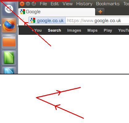
>>> On the note of which control to put in the top left, what if we extended
>>> the launcher to the top (as has been previously mentioned) but then have it
>>> so that you can either close by clicking the close button, or by moving the
>>> mouse to the top left corner, and then right, along the top, to close.
>>>
>>> e.g. Top one is pointer movement, bottom one is mouse movement.
>>>
>>>
>>> Matt
>>>
>>> On 19/05/12 20:18, shane lee wrote:
>>>
>>> But the point I have against the close-in-the-corner argument, as I
>>> have said before, is that not every window is used maximized and some
>>> windows cannot be maximized at all (System Settings, Calculator) so
>>> there is never a common close spot.
>>>
>>> Because the window buttons for maximized windows are hidden, then
>>> there could be a case to have a set spot to aim for but the answer to
>>> that is to keep the window buttons visible all the time.
>>>
>>> I believe that is the direction the last discussion was heading and a
>>> developer (Trevino) demonstrated a patch to keep the window buttons
>>> showing always but nobody responded to it after that.
>>>
>>> On 19 May 2012 19:16, Alex Smith <ais523@xxxxxxxxxx> <ais523@xxxxxxxxxx> wrote:
>>>
>>> On Sat, 2012-05-19 at 13:06 -0500, Aditya Vaidya wrote:
>>>
>>> If one uses autohide, this problem doesn't really exist because all of
>>> the space below that corner is also being used. However, if one uses
>>> the always-visible launcher, then the problem does exist. I suggest
>>> that, if the user is using an always-visible launcher, the launcher
>>> goes all the way to the top of the screen, cutting down those ~48px of
>>> space from the panel but also removing that ugly corner. Yes, the
>>> panel will be a little shorter, but it is, in my opinion, a good
>>> sacrifice to remove that visual "glitch". Not sure if this has been
>>> suggested before, but I'll suggest it again if it has.
>>>
>>> One big argument here is what we use the important top-left corner of
>>> the screen for. It's one of the easiest places on the screen to move the
>>> mouse quickly; and at the moment, the "close current window" button is
>>> there. If we lengthened the panel up to the top of the screen, the Dash
>>> button would be there instead, which at least I use less commonly than
>>> opening the window.
>>>
>>> (We don't make perfect use of the other screen corners either, by the
>>> way; bottom-left is for the trash, which is not the sort of thing that's
>>> accessed often enough to need a corner, and bottom-right isn't used for
>>> anything. I guess having an unbound corner is useful as Compiz allows
>>> you to bind things to screen corners, which would require a corner
>>> that's not already being used for other things.)
>>>
>>> --
>>> ais523
>>>
>>>
>>> --
>>> Mailing list: https://launchpad.net/~unity-design
>>> Post to : unity-design@xxxxxxxxxxxxxxxxxxx
>>> Unsubscribe : https://launchpad.net/~unity-design
>>> More help : https://help.launchpad.net/ListHelp
>>>
>>>
>>>
>>>
>>>
>>> I have a radically different approach to this problem.
>>>
>>> Firefox had one close button for all tabs and it was
>>> always in the same place. Unity has close buttons
>>> and they're almost always on top left.
>>>
>>> The Firefox community pressured the Firefox officials
>>> to make a tab have its close icon inside the tab. Firefox
>>> now has one close button per tab.
>>>
>>> *Place a close button by the right of a launcher icon
>>> of an app that is running.*
>>>
>>> You people should really look at my ideas instead of
>>> looking at the way that I showed my ideas.
>>>
>>> Best regards,
>>> Pedro Bessa
>>>
>>> --
>>> Mailing list: https://launchpad.net/~unity-design
>>> Post to : unity-design@xxxxxxxxxxxxxxxxxxx
>>> Unsubscribe : https://launchpad.net/~unity-design
>>> More help : https://help.launchpad.net/ListHelp
>>>
>>>
>>
>>
>> --
>> *Csonka Bálint* @913
>>
>> Ever heard of the FItt's law that says that close should be in the
>> corner? Firefox went against it once and it worked. Chromium went against
>> it (when you click the only open tab's close button, Chromium closes its
>> window AND tab) and it worked. That's why it's revolutionary. Close doesn't
>> have to be in the corner.
>>
>
>
>
> --
> *Csonka Bálint* @913
>
>
--
*Csonka Bálint* @913
References
-
Fwd: Thoughts on the top left corner? Can it be done better or prettier?
From: Pedro Bessa, 2012-05-17
-
Re: Fwd: Thoughts on the top left corner? Can it be done better or prettier?
From: shane lee, 2012-05-17
-
Re: Fwd: Thoughts on the top left corner? Can it be done better or prettier?
From: Ryan Gauger, 2012-05-17
-
Re: Fwd: Thoughts on the top left corner? Can it be done better or prettier?
From: Ian Santopietro, 2012-05-18
-
Re: Fwd: Thoughts on the top left corner? Can it be done better or prettier?
From: shane lee, 2012-05-18
-
Re: Fwd: Thoughts on the top left corner? Can it be done better or prettier?
From: Ian Santopietro, 2012-05-18
-
Re: Fwd: Thoughts on the top left corner? Can it be done better or prettier?
From: shane lee, 2012-05-18
-
Re: Fwd: Thoughts on the top left corner? Can it be done better or prettier?
From: Aditya Vaidya, 2012-05-19
-
Re: Fwd: Thoughts on the top left corner? Can it be done better or prettier?
From: Alex Smith, 2012-05-19
-
Re: Fwd: Thoughts on the top left corner? Can it be done better or prettier?
From: shane lee, 2012-05-19
-
Re: Fwd: Thoughts on the top left corner? Can it be done better or prettier?
From: Matt Richardson, 2012-05-22
-
Re: Fwd: Thoughts on the top left corner? Can it be done better or prettier?
From: Matt Richardson, 2012-05-22
-
Re: Fwd: Thoughts on the top left corner? Can it be done better or prettier?
From: Pedro Bessa, 2012-05-26
-
Re: Fwd: Thoughts on the top left corner? Can it be done better or prettier?
From: balint777@xxxxxxxxx, 2012-05-26
-
Re: Fwd: Thoughts on the top left corner? Can it be done better or prettier?
From: balint777@xxxxxxxxx, 2012-05-26