unity-design team mailing list archive
-
 unity-design team
-
Mailing list archive
-
Message #10005
Re: Proposal: An alternate icon scheme for the Messaging Menu
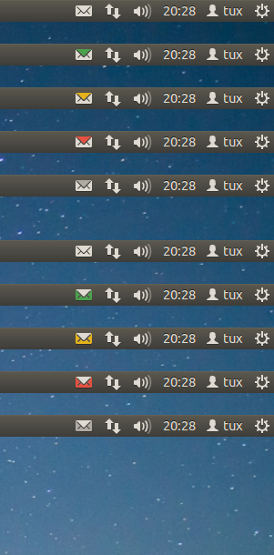
Here they are.

I like Sam's idea of having big dots as menu entries, they look much
cleaner and better than 12.04 or the current 12.10 icons.

On Tue, Sep 25, 2012 at 9:09 PM, Mark Shuttleworth <mark@xxxxxxxxxx> wrote:

>
> This is pretty good! I wonder if we couldn't colour the sides rather than
> the top?
>
Attachment:
messaging-menu2.png
Description: PNG image
Follow ups
References