Am 31.08.2011 08:52, schrieb Thorsten Wilms:
On 08/31/2011 02:25 AM, Conscious User wrote:1 - use an outline 2 - use the opposite of the background in a chosen color space3 - switch to black text for any background that exceeds some brightness level on most of its surface.4 - forget about the transparency. Set static back- and foreground colors. Have a heart for everyone with less than perfect vision.It should be mentioned that GNOME always had this problem with the label of desktop icons...Indeed, if I squint my eyes just a bit, what I see resembles a badly rendered dark gray text. That is, what I can see is the shadow duplicate of the text, while the white original only serves to shoot holes through it.This is why I propose to switch the main text color, if you don't restrict the background more tightly.
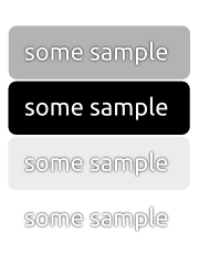
If we use the same approach currently implemented in notify-osd, we don't need to make any of the text in the dash adapt to the background, restrict anything or add even more logic in code. notify-osd does all its text-rendering with a centered and slightly blurred drop-shadow (white text against black drop-shadow).
This makes sure there's always enough contrast for the text no matter what kind of background is used. See the attached sample for the technique implemented in notify-osd.
I also added this suggestion to LP: #824916

Best regards...

Mirco
Attachment:
text-rendering-suggestion.png
Description: PNG image