| Thread Previous • Date Previous • Date Next • Thread Next |
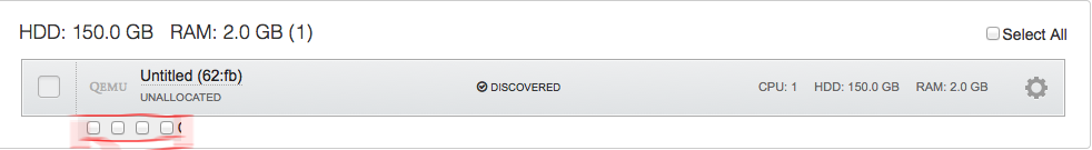
Hi,

I would like to bring up a topic about Fuel UI usability. I found that
usability in Node tab should be slightly improved. I hope Quality Assurance
guys and gals who scroll down/select nodes every day have own opinion about
usability. Personally, I think that there should be checkboxes next to
or/down to "discovered node" where user can specify the role of node. I am
just proposing and this can be first iteration of discussion. All I want is
to reduce number of clicks and scrolls, order details in more logical order
for our happy users.

I look forward to hearing back from you.

--
Best regards,
Sergii Golovatiuk,
Skype #golserge
IRC #holser
Attachment:
proposes.png
Description: PNG image
Attachment:
current.png
Description: PNG image
| Thread Previous • Date Previous • Date Next • Thread Next |