fuel-dev team mailing list archive
-
 fuel-dev team
-
Mailing list archive
-
Message #01352
Re: UI Usability
Hi Sergii,
I agree w/ you, the flow right now is a bit exhausting. Let take a look at
"Add node" workflow
*for each @node {*
*1. Click Add nodes*
*2. Scroll down*
*3. Select an unallocated node*
*4. Scroll up*
*5. Select the role*
*6. Press Apply changes*
*}*
...and the more "unallocated" nodes and/or roles Fuel master has on "Add
nodes" screen - the longer is the list, the worse is the scrolling.
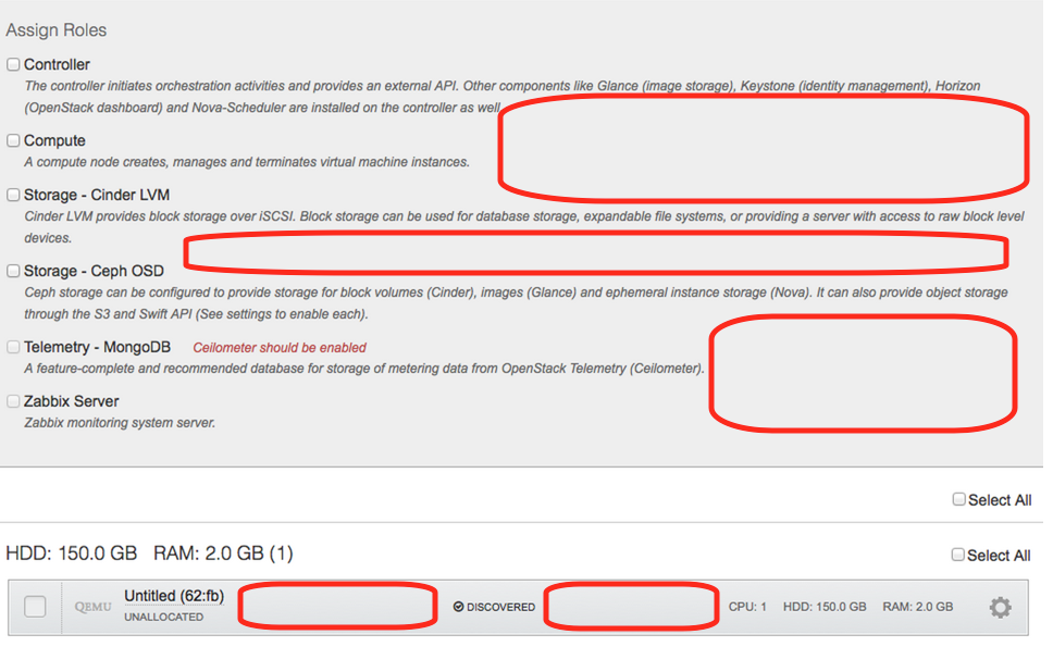
Another problem is sub-optimal usage of horizontal space:
[image: Inline image 1]
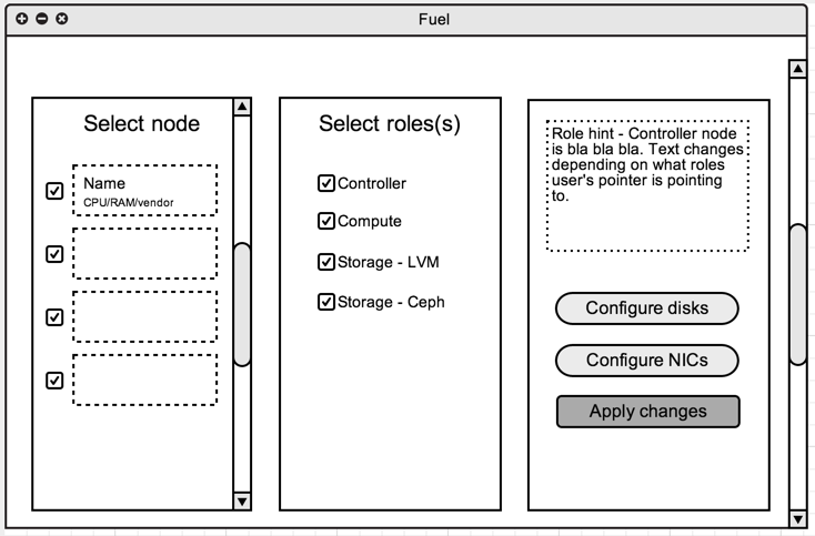
My suggestion for solution is to apply JIRA-like patter w/ columns for "Add
nodes" screen:
[image: Inline image 2]
---
Regards,
Dmitriy
On Thu, Jul 17, 2014 at 9:34 PM, Sergii Golovatiuk <sgolovatiuk@xxxxxxxxxxxx
> wrote:
> Hi,
>
> I would like to bring up a topic about Fuel UI usability. I found that
> usability in Node tab should be slightly improved. I hope Quality Assurance
> guys and gals who scroll down/select nodes every day have own opinion about
> usability. Personally, I think that there should be checkboxes next to
> or/down to "discovered node" where user can specify the role of node. I am
> just proposing and this can be first iteration of discussion. All I want is
> to reduce number of clicks and scrolls, order details in more logical order
> for our happy users.
>
> I look forward to hearing back from you.
>
> --
> Best regards,
> Sergii Golovatiuk,
> Skype #golserge
> IRC #holser
>
> --
> Mailing list: https://launchpad.net/~fuel-dev
> Post to : fuel-dev@xxxxxxxxxxxxxxxxxxx
> Unsubscribe : https://launchpad.net/~fuel-dev
> More help : https://help.launchpad.net/ListHelp
>
>
Follow ups
References