fuel-dev team mailing list archive
-
 fuel-dev team
-
Mailing list archive
-
Message #01355
Re: UI Usability
Hey Bogdan,

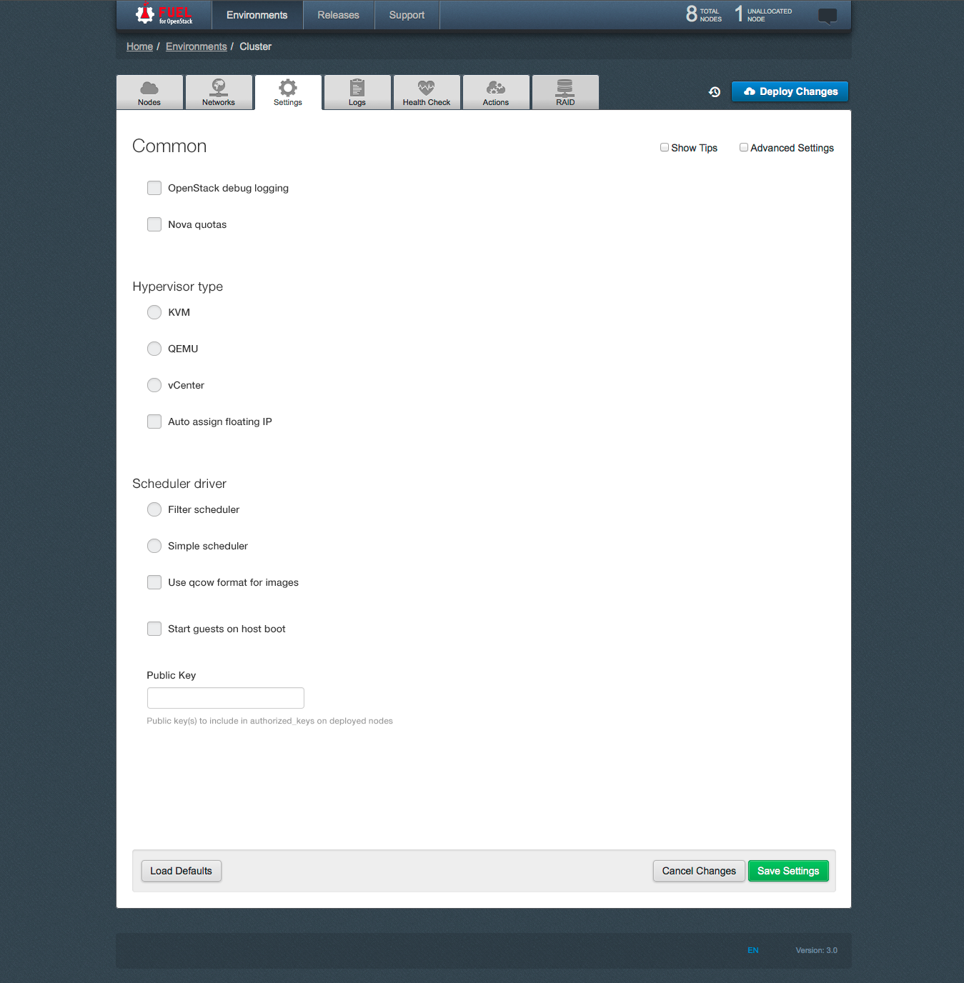
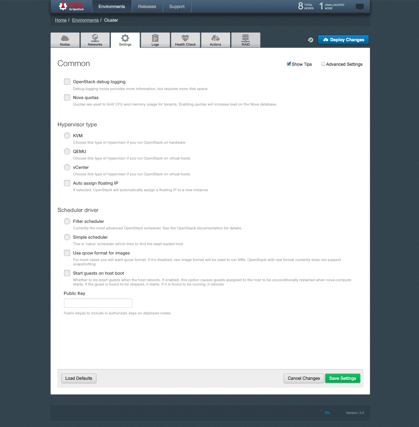
New UI looks nice. My 2c: the horizontal space is still under-utilized. my
thoughts: make 2 columns, use right one to show text hints (when user
points to some specific group of settings)


---
Regards,
Dmitriy


On Fri, Jul 18, 2014 at 5:27 PM, Bogdan Dudko <bdudko@xxxxxxxxxxxx> wrote:

> Hi.
>
> Thank you for your review of our UI.
> Our team is aware of this problem and we have for some time been working
> on improving the usability of the tab "Settings".
>
> Prototype of a new design of "Settings" tab is attached.
>
> [image: Встроенное изображение 2][image: Встроенное изображение 3][image:
> Встроенное изображение 1]
>
>
> 2014-07-17 22:17 GMT+03:00 Meg McRoberts <mmcroberts@xxxxxxxxxxxx>:
>
> Yes, the Fuel UI does need a usability review -- it's such a nice
>> interface with
>> just a few little rough spots.    While you are at it, feel free to
>> critique the User's
>> Guide, which in a way is an extension of the Fuel UI:
>>
>> http://docs.mirantis.com/openstack/fuel/master/user-guide.html#settings-tab
>> I would love it if people doing support could suggest additional material
>> to add
>> to the description of the various screens -- the questions you get from
>> support
>> probably indicate things that are not clear to new users.
>>
>> A couple specific issues:
>> - The "Settings" Tab contains an utter mismash.  One possibility is to
>> subdivide it -- the
>>   intro to the doc has a description of what is here that might e a
>> blueprint for
>>   how to subdivide it:
>> http://docs.mirantis.com/openstack/fuel/master/user-guide.html#settings-tab
>> - The "Logs" tab seems worth a glance -- I'm not sure why these logs were
>> selected
>>   for inclusion here and it seems that the descriptive names may not be
>> the most
>>   informative for new users.  It may be that what we have is perfect and
>> the docs need
>>   to explain what they are -- that needs to happen in any event.
>>
>> meg
>>
>>
>> On Thu, Jul 17, 2014 at 11:34 AM, Sergii Golovatiuk <
>> sgolovatiuk@xxxxxxxxxxxx> wrote:
>>
>>> Hi,
>>>
>>> I would like to bring up a topic about Fuel UI usability. I found that
>>> usability in Node tab should be slightly improved. I hope Quality Assurance
>>> guys and gals who scroll down/select nodes every day have own opinion about
>>> usability. Personally, I think that there should be checkboxes next to
>>> or/down to "discovered node" where user can specify the role of node. I am
>>> just proposing and this can be first iteration of discussion. All I want is
>>> to reduce number of clicks and scrolls, order details in more logical order
>>> for our happy users.
>>>
>>> I look forward to hearing back from you.
>>>
>>> --
>>> Best regards,
>>> Sergii Golovatiuk,
>>> Skype #golserge
>>> IRC #holser
>>>
>>> --
>>> Mailing list: https://launchpad.net/~fuel-dev
>>> Post to     : fuel-dev@xxxxxxxxxxxxxxxxxxx
>>> Unsubscribe : https://launchpad.net/~fuel-dev
>>> More help   : https://help.launchpad.net/ListHelp
>>>
>>>
>>
>> --
>> Mailing list: https://launchpad.net/~fuel-dev
>> Post to     : fuel-dev@xxxxxxxxxxxxxxxxxxx
>> Unsubscribe : https://launchpad.net/~fuel-dev
>> More help   : https://help.launchpad.net/ListHelp
>>
>>
>
> --
> Mailing list: https://launchpad.net/~fuel-dev
> Post to     : fuel-dev@xxxxxxxxxxxxxxxxxxx
> Unsubscribe : https://launchpad.net/~fuel-dev
> More help   : https://help.launchpad.net/ListHelp
>
>


Follow ups
References