fuel-dev team mailing list archive
-
 fuel-dev team
-
Mailing list archive
-
Message #01351
Re: UI Usability
Hi.
Thank you for your review of our UI.
Our team is aware of this problem and we have for some time been working on
improving the usability of the tab "Settings".
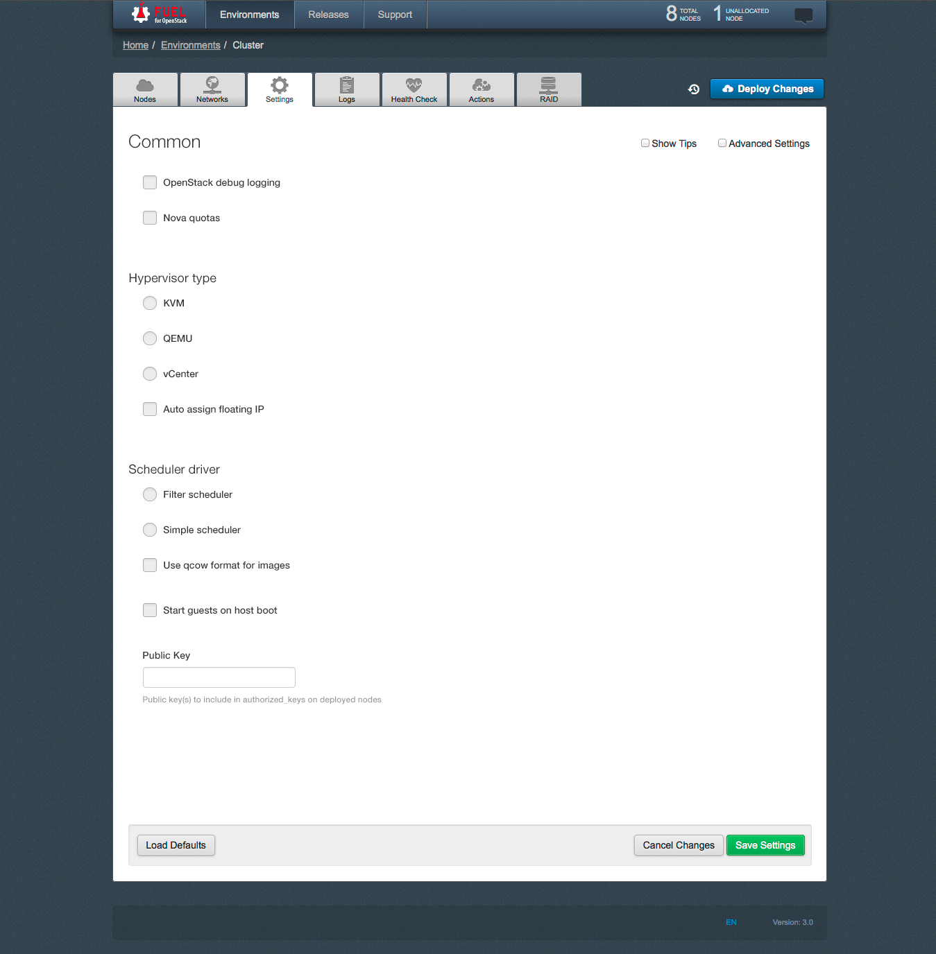
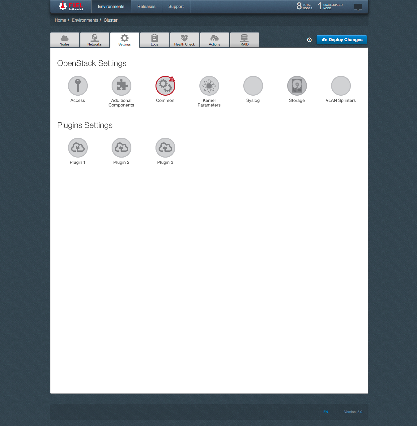
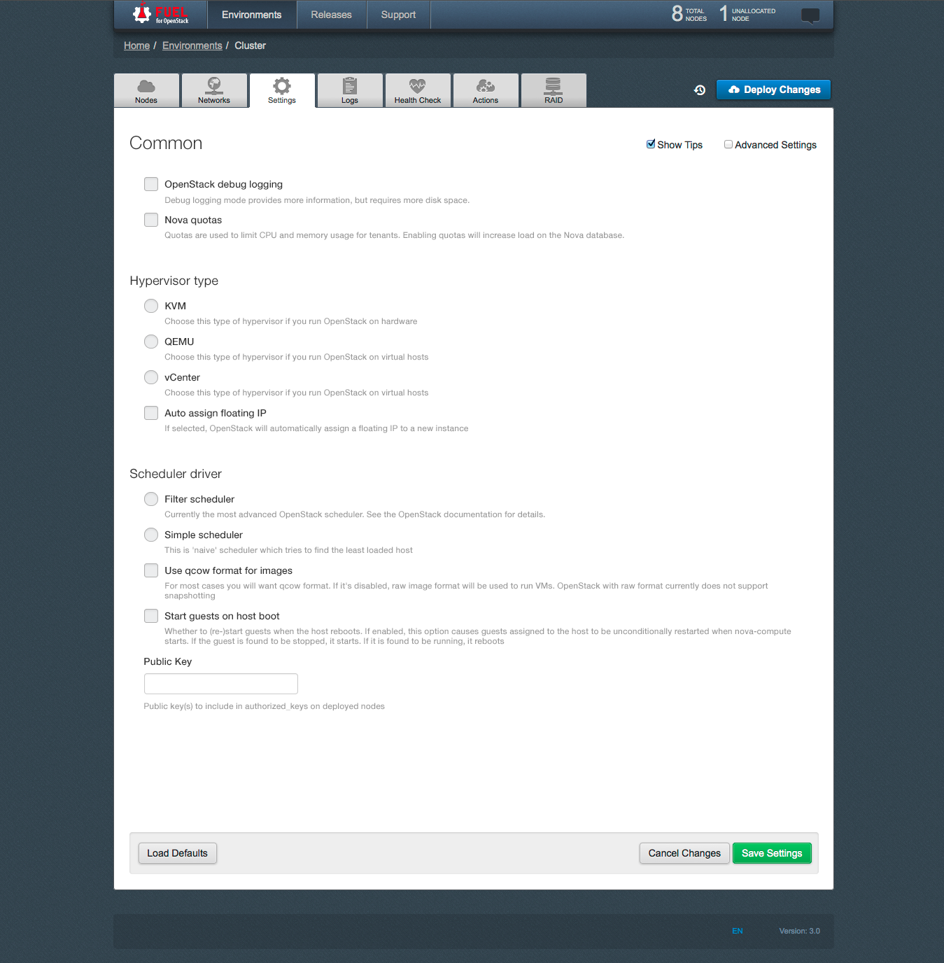
Prototype of a new design of "Settings" tab is attached.
[image: Встроенное изображение 2][image: Встроенное изображение 3][image:
Встроенное изображение 1]
2014-07-17 22:17 GMT+03:00 Meg McRoberts <mmcroberts@xxxxxxxxxxxx>:
> Yes, the Fuel UI does need a usability review -- it's such a nice
> interface with
> just a few little rough spots. While you are at it, feel free to
> critique the User's
> Guide, which in a way is an extension of the Fuel UI:
> http://docs.mirantis.com/openstack/fuel/master/user-guide.html#settings-tab
> I would love it if people doing support could suggest additional material
> to add
> to the description of the various screens -- the questions you get from
> support
> probably indicate things that are not clear to new users.
>
> A couple specific issues:
> - The "Settings" Tab contains an utter mismash. One possibility is to
> subdivide it -- the
> intro to the doc has a description of what is here that might e a
> blueprint for
> how to subdivide it:
> http://docs.mirantis.com/openstack/fuel/master/user-guide.html#settings-tab
> - The "Logs" tab seems worth a glance -- I'm not sure why these logs were
> selected
> for inclusion here and it seems that the descriptive names may not be
> the most
> informative for new users. It may be that what we have is perfect and
> the docs need
> to explain what they are -- that needs to happen in any event.
>
> meg
>
>
> On Thu, Jul 17, 2014 at 11:34 AM, Sergii Golovatiuk <
> sgolovatiuk@xxxxxxxxxxxx> wrote:
>
>> Hi,
>>
>> I would like to bring up a topic about Fuel UI usability. I found that
>> usability in Node tab should be slightly improved. I hope Quality Assurance
>> guys and gals who scroll down/select nodes every day have own opinion about
>> usability. Personally, I think that there should be checkboxes next to
>> or/down to "discovered node" where user can specify the role of node. I am
>> just proposing and this can be first iteration of discussion. All I want is
>> to reduce number of clicks and scrolls, order details in more logical order
>> for our happy users.
>>
>> I look forward to hearing back from you.
>>
>> --
>> Best regards,
>> Sergii Golovatiuk,
>> Skype #golserge
>> IRC #holser
>>
>> --
>> Mailing list: https://launchpad.net/~fuel-dev
>> Post to : fuel-dev@xxxxxxxxxxxxxxxxxxx
>> Unsubscribe : https://launchpad.net/~fuel-dev
>> More help : https://help.launchpad.net/ListHelp
>>
>>
>
> --
> Mailing list: https://launchpad.net/~fuel-dev
> Post to : fuel-dev@xxxxxxxxxxxxxxxxxxx
> Unsubscribe : https://launchpad.net/~fuel-dev
> More help : https://help.launchpad.net/ListHelp
>
>
Follow ups
References