gtg-contributors team mailing list archive
-
 gtg-contributors team
-
Mailing list archive
-
Message #00956
Re: Redesign: Mockups and Stuff (Round 2)
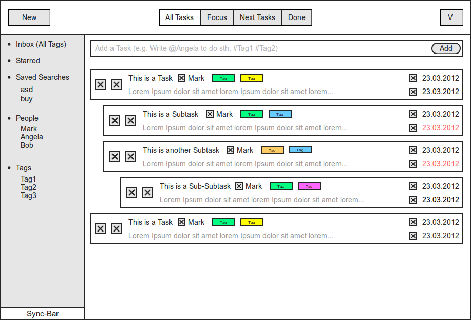
Hmm. Ok, I think I get the issue you were point earlier now.
So, I am indeed thinking about a "All task" items in the sidebar (just like
in your mockup). But, as you point it out, this causes an issue with the
view name (i.e. the "All" button in the top bar). I have the feeling this
should be solved by adopting a better name in the top bar. Maybe a simple
"Browse"/"Task browser" would do?
Regarding the second wireframe (editor), this is indeed what I was thinking
about.
Bertrand
On Sun, Apr 15, 2012 at 2:41 PM, Alexander Barnickel <alba@xxxxxxxxxxxxx>wrote:
> Did you mean like this?
>
>
>
>
> Am 15.04.2012 14:11, schrieb Bertrand Rousseau:
>
>
> Hi,
>
> They look great! It feels more and more solid too!
>
> I have again some remarks I'd like to share with you, they're below. (btw,
> I hope I don't seem too picky. I really like what you're proposing!)
>
> Thanks again for the awesome work you're doing! Tell us when your mockups
> will be available for edition (I'd like to test some ideas)!
>
> Bertrand
>
> *Main window*
>
> I like the way you solved the need for visual separation between the
> sidebar and the task list. The subtle light grey background is a nice and
> subtle clue.
>
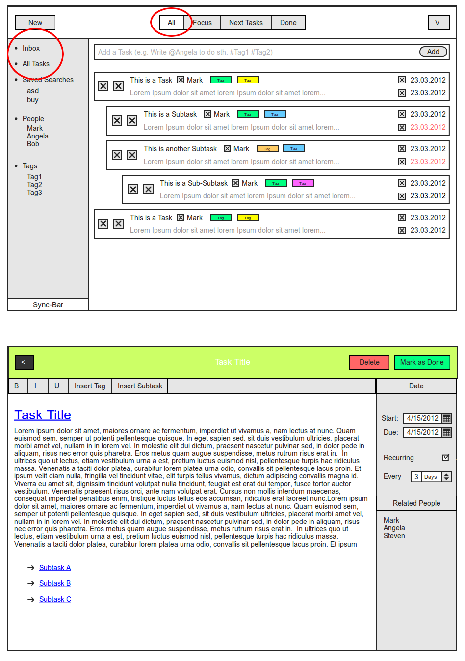
> Regarding "Inbox", you seem to suggest that the inbox is the same as the
> "all tags" filter. I don't think it's a good idea to merge both. Inbox is
> reserved for incoming/not yet sorted tasks. All tags (or, I'd say, "All
> tasks") should be a separate items that allows to look at all available
> (and not-yet-done) tasks, without any kind of filtering. It should be a
> separate item.
>
> *Task editor
> *
> Instead of "a task", the editor title could be the task title itself.
>
> There should aeybe be a clue about how to go back to the task list in the
> header (like the left-pointing triangle in [1]). Also the "Done" label is a
> bit confusing: would pressing it mark the as done or return to the task
> list? Maybe a different wording (e.g. "Return to task list" - which is a
> bit long, though), or just replacing this button by a left-pointing
> triangle would do.
>
> I wonder if it wouldn't more interesting to rearrange the toolbar a bit:
> - place "mark as done" and "delete" in the header (e.g. on the right)
> - leave only edition-related buttons in the toolbar
>
> Maybe the sidebar could be arranged in sections, just like the task
> browser sidebar. The first would obviously be "Date". There could be
> additional (and/or optional) sections, like "Related tags", "Related
> people", etc. (it would thus be a playground for plugins).
>
> [1]
> https://live.gnome.org/Design/Apps/Music?action=AttachFile&do=get&target=Music.png
>
> On Sun, Apr 15, 2012 at 12:49 PM, Alexander Barnickel <alba@xxxxxxxxxxxxx
> > wrote:
>
>> **Upadte**
>>
>> Visual Design:
>>
>>
>>
>> Wireframe:
>>
>>
>>
>> Edit Mode:
>>
>>
>>
>> _______________________________________________
>> Mailing list: https://launchpad.net/~gtg-contributors
>> Post to : gtg-contributors@xxxxxxxxxxxxxxxxxxx
>> Unsubscribe : https://launchpad.net/~gtg-contributors
>> More help : https://help.launchpad.net/ListHelp
>>
>>
>
>
> --
> Bertrand Rousseau
>
>
>
--
Bertrand Rousseau
Follow ups
References