gtg-contributors team mailing list archive
-
 gtg-contributors team
-
Mailing list archive
-
Message #00957
Re: Redesign: Mockups and Stuff (Round 2)
On Sun, Apr 15, 2012 at 6:11 PM, Alexander Barnickel <alba@xxxxxxxxxxxxx>wrote:
> Did you mean like this?
>
>
>
About the task browser: would "All" be a good name?
Task editor is looking better now!
One question though, shouldn't we also keep number of
recurrences/recurs till option too?
> Am 15.04.2012 14:11, schrieb Bertrand Rousseau:
>
>
> Hi,
>
> They look great! It feels more and more solid too!
>
> I have again some remarks I'd like to share with you, they're below. (btw,
> I hope I don't seem too picky. I really like what you're proposing!)
>
> Thanks again for the awesome work you're doing! Tell us when your mockups
> will be available for edition (I'd like to test some ideas)!
>
> Bertrand
>
> *Main window*
>
> I like the way you solved the need for visual separation between the
> sidebar and the task list. The subtle light grey background is a nice and
> subtle clue.
>
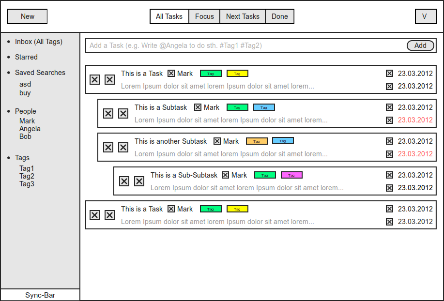
> Regarding "Inbox", you seem to suggest that the inbox is the same as the
> "all tags" filter. I don't think it's a good idea to merge both. Inbox is
> reserved for incoming/not yet sorted tasks. All tags (or, I'd say, "All
> tasks") should be a separate items that allows to look at all available
> (and not-yet-done) tasks, without any kind of filtering. It should be a
> separate item.
>
> *Task editor
> *
> Instead of "a task", the editor title could be the task title itself.
>
> There should aeybe be a clue about how to go back to the task list in the
> header (like the left-pointing triangle in [1]). Also the "Done" label is a
> bit confusing: would pressing it mark the as done or return to the task
> list? Maybe a different wording (e.g. "Return to task list" - which is a
> bit long, though), or just replacing this button by a left-pointing
> triangle would do.
>
> I wonder if it wouldn't more interesting to rearrange the toolbar a bit:
> - place "mark as done" and "delete" in the header (e.g. on the right)
> - leave only edition-related buttons in the toolbar
>
> Maybe the sidebar could be arranged in sections, just like the task
> browser sidebar. The first would obviously be "Date". There could be
> additional (and/or optional) sections, like "Related tags", "Related
> people", etc. (it would thus be a playground for plugins).
>
> [1]
> https://live.gnome.org/Design/Apps/Music?action=AttachFile&do=get&target=Music.png
>
> On Sun, Apr 15, 2012 at 12:49 PM, Alexander Barnickel <alba@xxxxxxxxxxxxx
> > wrote:
>
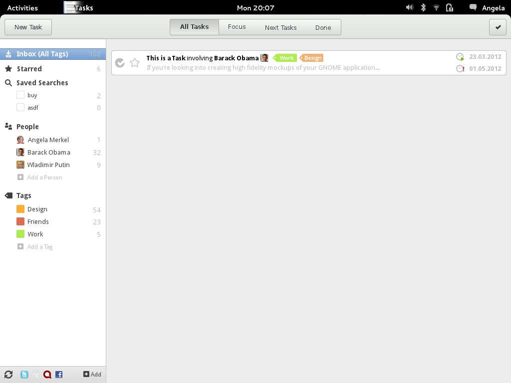
>> **Upadte**
>>
>> Visual Design:
>>
>>
>>
>> Wireframe:
>>
>>
>>
>> Edit Mode:
>>
>>
>>
>> _______________________________________________
>> Mailing list: https://launchpad.net/~gtg-contributors
>> Post to : gtg-contributors@xxxxxxxxxxxxxxxxxxx
>> Unsubscribe : https://launchpad.net/~gtg-contributors
>> More help : https://help.launchpad.net/ListHelp
>>
>>
>
>
> --
> Bertrand Rousseau
>
>
>
> _______________________________________________
> Mailing list: https://launchpad.net/~gtg-contributors
> Post to : gtg-contributors@xxxxxxxxxxxxxxxxxxx
> Unsubscribe : https://launchpad.net/~gtg-contributors
> More help : https://help.launchpad.net/ListHelp
>
>
Follow ups
References