| Thread Previous • Date Previous • Date Next • Thread Next |
Hi!
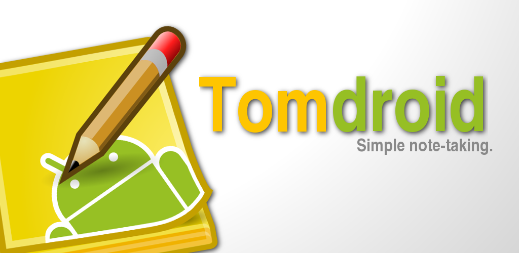
Today I did a Feature Graphic for the Android Market and I wanted to
hear your opinion.
I kept it really simple and clean. Everything is changeable. So if you
do not like a colour, the shadows or the gradient please tell me. Also
if you have better suggestions, please comment!
The specs are following:
* *Feature Graphic (Optional):*
o Use: The featured section in Android Market. Will be
downsized to mini or micro.
o Specs: 1024w x 500h, 24 bit PNG or JPEG (no alpha) with no
transparency
o Tips:
+ Use a safe frame of 924x400 (50 pixel of safe padding
on each side). All the important content of the
graphic should be within this safe frame. Pixels
outside of this safe frame may be cropped for
stylistic purposes.
+ If incorporating text, use large font sizes, and keep
the graphic simple, as this graphic may be scaled down
from its original size.
+ This graphic may be displayed alone without the app icon.
For the "Tomdroid" characters I have chosen the Android-green and the
Tomboy-yellow and gray. The icon is our new icon tuned a little bit
and the gradient is just a light effect from above.
Cheers,
Jango
Attachment:
Feature_Graphic.png
Description: PNG image
Attachment:
Feature_Graphic.xcf
Description: image/xcf
| Thread Previous • Date Previous • Date Next • Thread Next |