unity-design team mailing list archive
-
 unity-design team
-
Mailing list archive
-
Message #03083
Re: Me Menu - Review
On 22 June 2010 04:08, Frederik Nnaji <frederik.nnaji@xxxxxxxxx> wrote:
> On Mon, Jun 21, 2010 at 11:42, James Putt <putt.james@xxxxxxxxx> wrote:
>>
>> Whether colours come or not, I'd like to suggest some refinements for
>> the existing (lucid) set.
>
> i'm curious..
>
>>
>> Something that confuses me is the offline icon's similarity to the
>> "i'm visible" states' icons.
>
> thank you.
> the problem i have with it is that it is bold-faced, which indicates
> activity, ON or "open".
Yes that's my reaction to it too. Something like "woah hey I didn't
sign in there.. oh.. that's offline.."
> ..When it is clear enough that clicking it doesn't open or activate anything
> whatsoever:
> i still have to move to the other side of indicator date time to the
> messaging menu, in order to "activate" chat.
IIRC the me-menu will be controlling availability/status directly in maverick
>
>>
>> I'd suggest the current icon used for invisible (the dull speech bubble)
>> would be better suited to
>> offline, and a bubble with a dashed outline and no fill to represent
>> invisible.
>
> Nice! Much more suitable visual metaphors.
> Perhaps you may want to contribute these to the icon metaphor project here:
> [1]
> Towards the bottom of the page you'll find the section "Status", containing
> the current metaphors for "user-away" etc. - there is none for
> "user-invisible".
> Comparing your words with the table on that page and the concept of a DE
> relevant DnD mode, i think it is easy to conclude that the icon language we
> will eventually use does not solely represent IM status, but also real
> presence status for all the local appliances thereof.
> Meaning: more generic symbols, perhaps rather like in those in the Icon
> Metaphor project, rather than IM-specific speech bubbles.
> Honestly, circle, square, color and the absense of color are semantically
> sufficient to express all states we need to map. To map it explicitly:
> circle = ON
> green = available
> yellow = away from keyboard
> red = do not disturb
> dashed stroke = invisible // like this, James?
> square > OFF
>
>>
>> My other gripe is that the filled speech bubble is quite heavy
>> compared to the elegant power symbol and surrounding text. Maybe
>> basing the icons on the outline of a bubble may be worth a test?
>>
>> Agree/disagree?
>
> yeah, absolutely. Especially the bubble doesn't convey the full meaning of
> AVAILABLE, AWAY or DO NOT DISTURB. These values are not IM specific, they
> have system-wide relevance, let us not forget the notification system, power
> management and other stuff that could be interested in that information.
>
> ¹ http://tango.freedesktop.org/Icon_Metaphors
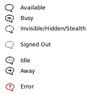
Heh I'll provide a picture and you might decide you disagree with me..
I'd quite like MeMenu statuses to stay related specifically to
presence/availability.
The attached picture is what I was thinking. In the menu itself, I'd
only have Available, Busy and Hidden as choosable statuses. Away would
happen automatically after a period of non-activity (a la google talk)
using the symbol I labelled as idle. Signed out would also be
choosable in the same list, unless there was another method to
disconnect (perhaps using the toggles featured in the new network menu
spec, or the account items).
A system-wide do not disturb would be neat, but I no longer think it
should be affected through my presence status. Rather, doing something
such as watching a movie in full screen may set my presence/status to
busy and hush non-urgent notifications.
Attachment:
bubbles.jpg
Description: JPEG image
Follow ups
References