unity-design team mailing list archive
-
 unity-design team
-
Mailing list archive
-
Message #06947
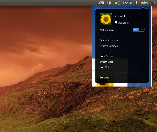
Indicator menu
I think it looks better when Ubuntu will use the same kind of pop-up
balloon as Gnome 3 does.
You can see what I mean in the screenshot.

In Apple OS X the menu looks more smooth because of subtle round corners.
http://osxdaily.com/wp-content/uploads/2009/10/wireless-info-airport-menu.jpg
The subtle changes make a OS look good.

Best regards,

Kostas
Attachment:
Schermafdruk op 2011-10-29 09:58:04.png
Description: PNG image
Follow ups