I disagree. Unity offers a very different experience (or at least they could, given different default settings. Setting backlights to toggle would clear up a lot of complaints about unity. On top of that, you get the aesthetic appeal of the square-ish icons and the usability/individuality of icons with shape.
On Mar 21, 2011 9:53 PM, "Vishnoo" <
vish@xxxxxxxxxx> wrote:
> On Sun, 2011-03-20 at 11:43 -0400, Saleel Velankar wrote:
>> On Sunday, March 20, 2011 8:46:25 PM Vishnoo wrote:
>>
>> > It's not just the shape.
>> > I would suggest you have a look at icons in iPad/iPhone and compare
>> > them. You will quickly realize where Canonical can get sued.. ;-)
>>
>> I don't have an opinion on this thread, but what are you talking about?
>
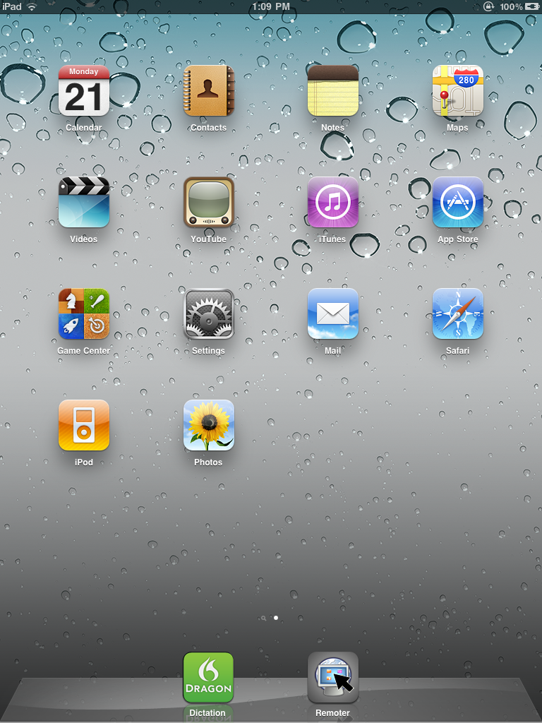
> For example, checkout the youtube icon in ipad:
> <
http://1.bp.blogspot.com/-4cuAAL5fpkA/TYeTdoRR4sI/AAAAAAAAArU/QdZuzt42Wrg/s1600/blogc.PNG>
> Look very similar to something else? ;)
>
> One can go on picking out others too, but it is not difficult to realize
> where the "inspiration" is from.
>
> It is amusing how some people hate Apple products and say "dont copy
> Apple", but the same people like Apple designs when they dont realize it
> is from Apple. [ just happened to reply this here, not referring to
> Saleel or anyone in particular, just a general observation ;) ]
>
>> iirc
>> iPad/iPhone icons are 60x60 pixels, and extremely glossy.
>
> Their guidelines are here:
> <
http://developer.apple.com/library/ios/#documentation/userexperience/conceptual/mobilehig/IconsImages/IconsImages.html#//apple_ref/doc/uid/TP40006556-CH14-SW1>
>
>
> --
> Cheers,
> Vish
>
>
> _______________________________________________
> Mailing list:
https://launchpad.net/~ayatana
> Post to :
ayatana@xxxxxxxxxxxxxxxxxxx> Unsubscribe :
https://launchpad.net/~ayatana> More help :
https://help.launchpad.net/ListHelp