fuel-dev team mailing list archive
-
 fuel-dev team
-
Mailing list archive
-
Message #01361
Re: UI Usability
Another issue is the constant scrolling to get to the save/apply or deploy
/run buttons, as well as moving away from a page with changes. I've already
created bug [1] for this.

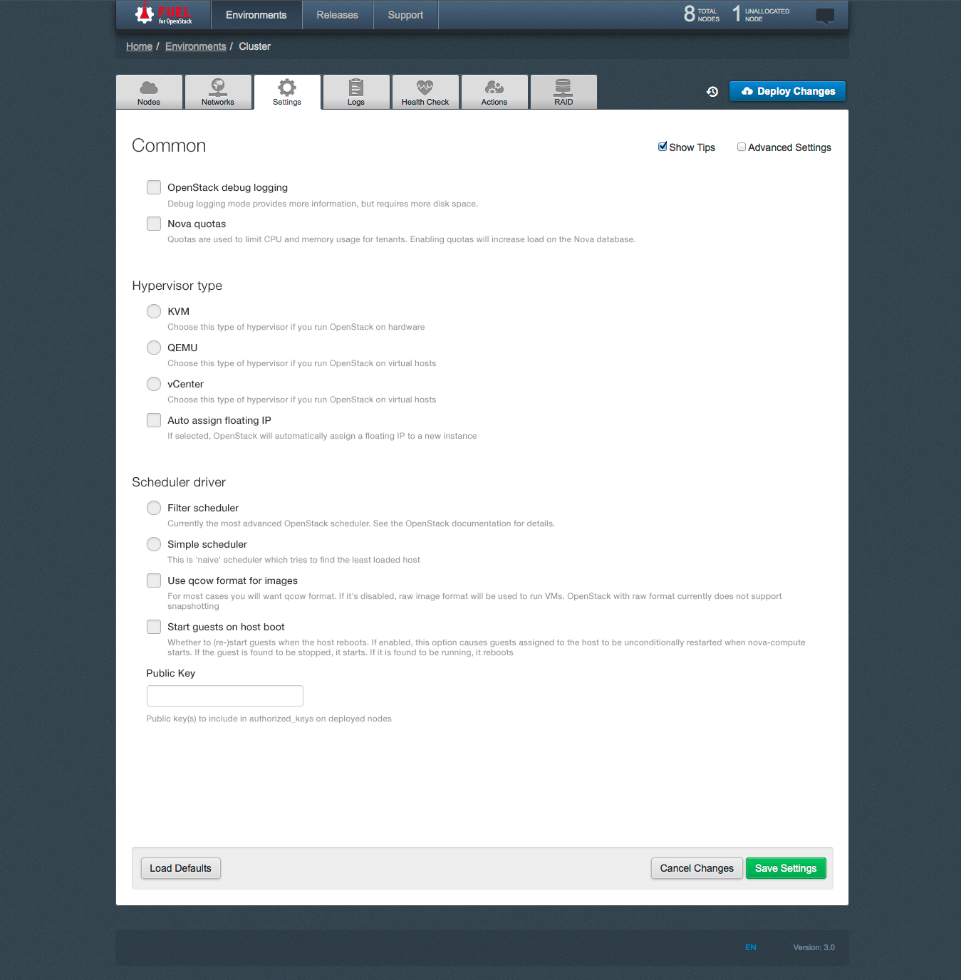
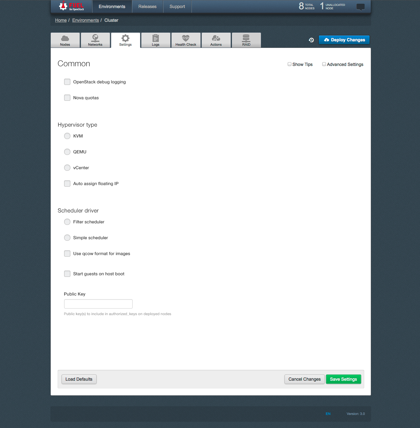
I would note that in Bogdan's mockups there is still large space when the
hints are removed, removing them is useless if the space isn't removed too.
(Hopefully it's just a mockup issue)

[1] https://bugs.launchpad.net/bugs/1340353


On Mon, Jul 21, 2014 at 4:05 AM, Andrey Danin <adanin@xxxxxxxxxxxx> wrote:

> Hi, Dmitry.
>
> I don't think the horizontal space is a big issue. With my screen
> resolution I have two empty spaces around the left and right side of the
> main window, and these spaces eat approx. 30% of total horizontal space.
> Anyway, I hope our UI guys will give us a better structured UI in future.
>
>
> On Sat, Jul 19, 2014 at 1:47 PM, Dmitriy Novakovskiy <
> dnovakovskiy@xxxxxxxxxxxx> wrote:
>
>> Hey Bogdan,
>>
>> New UI looks nice. My 2c: the horizontal space is still under-utilized.
>> my thoughts: make 2 columns, use right one to show text hints (when user
>> points to some specific group of settings)
>>
>>
>> ---
>> Regards,
>> Dmitriy
>>
>>
>> On Fri, Jul 18, 2014 at 5:27 PM, Bogdan Dudko <bdudko@xxxxxxxxxxxx>
>> wrote:
>>
>>> Hi.
>>>
>>> Thank you for your review of our UI.
>>> Our team is aware of this problem and we have for some time been working
>>> on improving the usability of the tab "Settings".
>>>
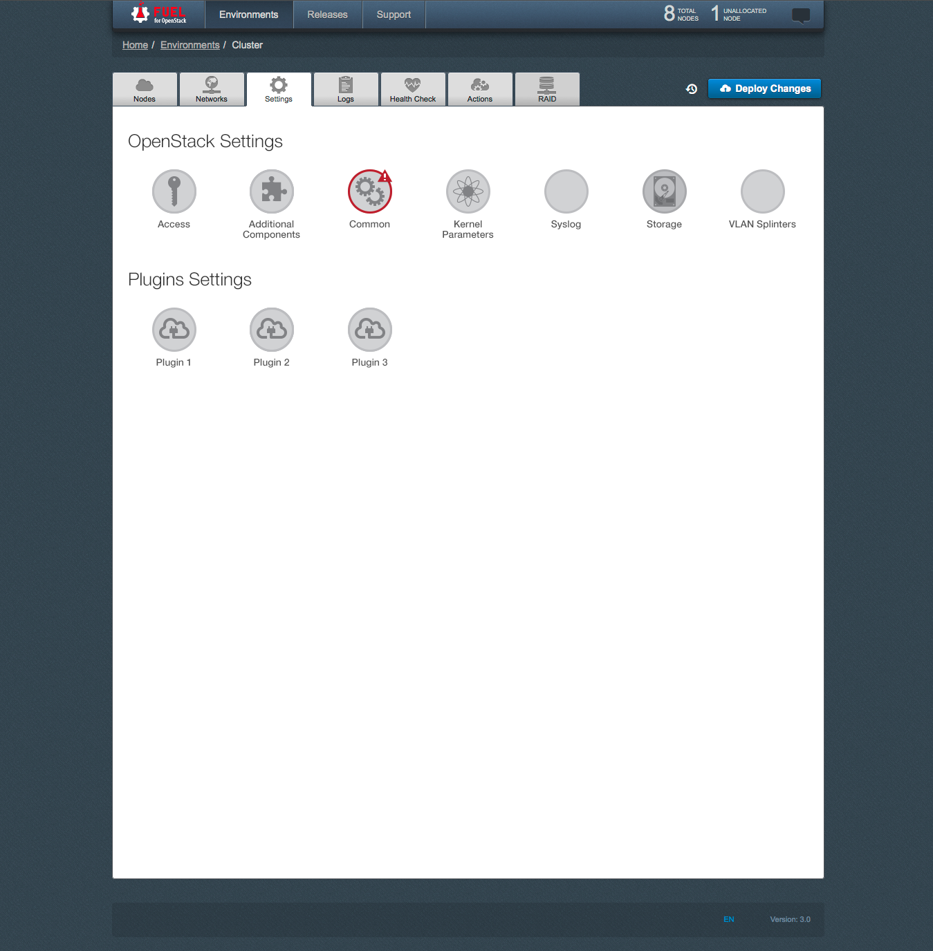
>>> Prototype of a new design of "Settings" tab is attached.
>>>
>>> [image: Встроенное изображение 2][image: Встроенное изображение 3][image:
>>> Встроенное изображение 1]
>>>
>>>
>>> 2014-07-17 22:17 GMT+03:00 Meg McRoberts <mmcroberts@xxxxxxxxxxxx>:
>>>
>>> Yes, the Fuel UI does need a usability review -- it's such a nice
>>>> interface with
>>>> just a few little rough spots.    While you are at it, feel free to
>>>> critique the User's
>>>> Guide, which in a way is an extension of the Fuel UI:
>>>>
>>>> http://docs.mirantis.com/openstack/fuel/master/user-guide.html#settings-tab
>>>> I would love it if people doing support could suggest additional
>>>> material to add
>>>> to the description of the various screens -- the questions you get from
>>>> support
>>>> probably indicate things that are not clear to new users.
>>>>
>>>> A couple specific issues:
>>>> - The "Settings" Tab contains an utter mismash.  One possibility is to
>>>> subdivide it -- the
>>>>   intro to the doc has a description of what is here that might e a
>>>> blueprint for
>>>>   how to subdivide it:
>>>> http://docs.mirantis.com/openstack/fuel/master/user-guide.html#settings-tab
>>>> - The "Logs" tab seems worth a glance -- I'm not sure why these logs
>>>> were selected
>>>>   for inclusion here and it seems that the descriptive names may not be
>>>> the most
>>>>   informative for new users.  It may be that what we have is perfect
>>>> and the docs need
>>>>   to explain what they are -- that needs to happen in any event.
>>>>
>>>> meg
>>>>
>>>>
>>>> On Thu, Jul 17, 2014 at 11:34 AM, Sergii Golovatiuk <
>>>> sgolovatiuk@xxxxxxxxxxxx> wrote:
>>>>
>>>>> Hi,
>>>>>
>>>>> I would like to bring up a topic about Fuel UI usability. I found that
>>>>> usability in Node tab should be slightly improved. I hope Quality Assurance
>>>>> guys and gals who scroll down/select nodes every day have own opinion about
>>>>> usability. Personally, I think that there should be checkboxes next to
>>>>> or/down to "discovered node" where user can specify the role of node. I am
>>>>> just proposing and this can be first iteration of discussion. All I want is
>>>>> to reduce number of clicks and scrolls, order details in more logical order
>>>>> for our happy users.
>>>>>
>>>>> I look forward to hearing back from you.
>>>>>
>>>>> --
>>>>> Best regards,
>>>>> Sergii Golovatiuk,
>>>>> Skype #golserge
>>>>> IRC #holser
>>>>>
>>>>> --
>>>>> Mailing list: https://launchpad.net/~fuel-dev
>>>>> Post to     : fuel-dev@xxxxxxxxxxxxxxxxxxx
>>>>> Unsubscribe : https://launchpad.net/~fuel-dev
>>>>> More help   : https://help.launchpad.net/ListHelp
>>>>>
>>>>>
>>>>
>>>> --
>>>> Mailing list: https://launchpad.net/~fuel-dev
>>>> Post to     : fuel-dev@xxxxxxxxxxxxxxxxxxx
>>>> Unsubscribe : https://launchpad.net/~fuel-dev
>>>> More help   : https://help.launchpad.net/ListHelp
>>>>
>>>>
>>>
>>> --
>>> Mailing list: https://launchpad.net/~fuel-dev
>>> Post to     : fuel-dev@xxxxxxxxxxxxxxxxxxx
>>> Unsubscribe : https://launchpad.net/~fuel-dev
>>> More help   : https://help.launchpad.net/ListHelp
>>>
>>>
>>
>> --
>> Mailing list: https://launchpad.net/~fuel-dev
>> Post to     : fuel-dev@xxxxxxxxxxxxxxxxxxx
>> Unsubscribe : https://launchpad.net/~fuel-dev
>> More help   : https://help.launchpad.net/ListHelp
>>
>>
>
>
> --
> Andrey Danin
> adanin@xxxxxxxxxxxx
> skype: gcon.monolake
>
> --
> Mailing list: https://launchpad.net/~fuel-dev
> Post to     : fuel-dev@xxxxxxxxxxxxxxxxxxx
> Unsubscribe : https://launchpad.net/~fuel-dev
> More help   : https://help.launchpad.net/ListHelp
>
>


--
Andrew
Mirantis
Ceph community


References